Launching an app for a retail giant
Timeline: Jan 2021 - Apr 2021
Role: Product Designer
Team: Myself, Gopika S. (Product Designer), Aurelio A. (Design Lead)
Platforms: App (iOS)
Academy is one of the world’s largest sports retailers and alongside my team, I helped them launch their first mobile app. I contributed to the designs of each part of the app and I owned the evaluative research strategy and execution.
Since it's launch, the app sits at a 4.9/5.0 rating from over 85,000 reviews.
overview
What is Academy Sports + Outdoors?
Academy (for short) is one of the largest sporting goods retailers in the US; they currently operate over 280 stores from the midwest to the south and southeast states. Their product assortment covers everything someone might need for hunting, fishing, barbecuing, or sports. When we engaged with our clients at Academy, they just finished off 2020 with revenue exceeding $5.6B.
the need
Academy needed a better channel to engage with its best customers
Since the COVID pandemic, e-commerce sales spiked and the need for sports and outdoors goods spiked as well, putting Academy in a fantastic position. The issue was, all of this traffic was going to their website. We helped Academy ideate ways to increase their engagement with this new influx of customers, and one of the outcomes was an app. The goals of releasing an app would be a new revenue stream and an opportunity to engage with customers using push-notifications to drive more sales.
For the initial MVP of the app, we aimed to have parity with the mobile web experience.
Understanding the customers
Three primary segments make up Academy's customer base
We planned to use this information in our design process by understanding their core needs and how each type of customer would benefit from a new feature. Though each segment had their own core focus, we still found that all segments would benefit from: convenience and details about fulfillment options, easy to access details about products and testimonials, and clear pricing and details on sales.
Once we knew the business need and who we were building this for, we were clear on the opportunity.
convenience chaser
They shop for what’s most convenient
Passion Pursuer
They want the newest and best products
Value Verifier
They want more bang for their buck
the opportunity
How might we maintain parity with the web experience, while also creating a more convenient purchasing experience to increase engagement?
the process
Researching best practices for the Product Details Page (PDP)
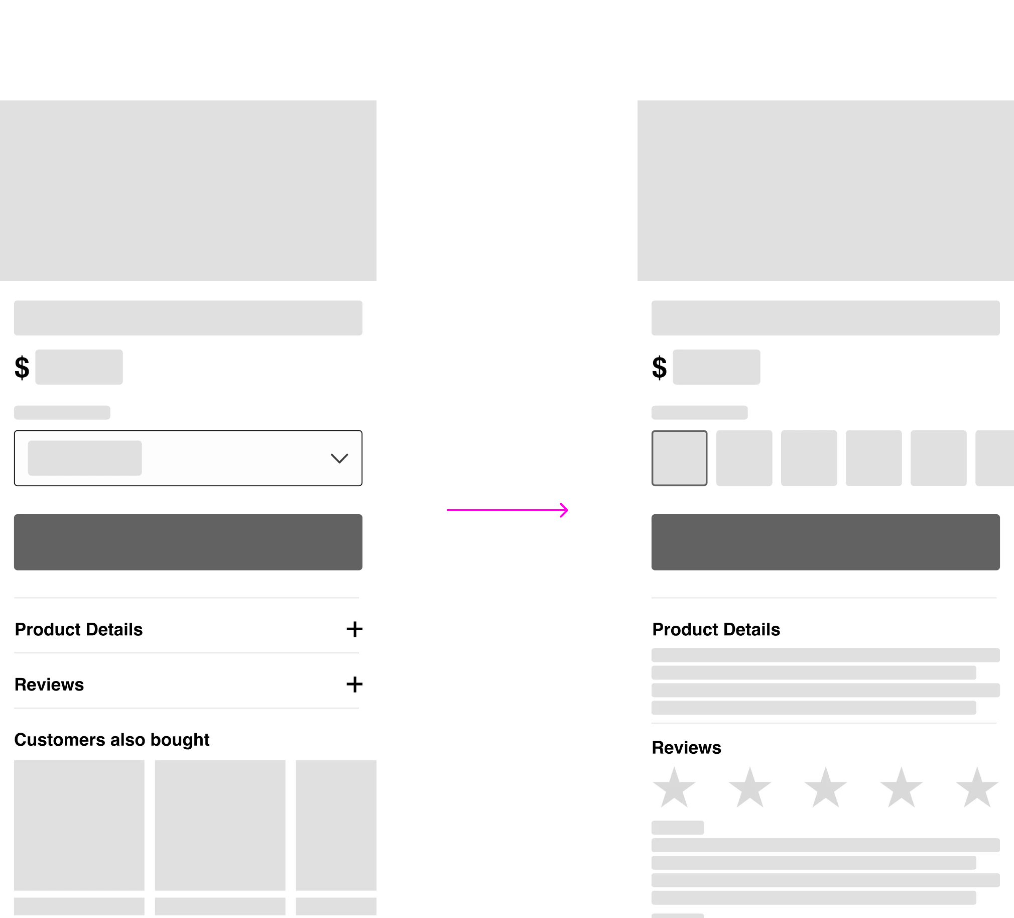
I took on the work for the PDP, while my team tackled other areas of the experience. Through resources such as Baymard and Nielsen Norman Group (NNG), I learned that customers are used to scrolling and swiping up, so I should avoid hiding information behind a drop down. The concept of “above the fold” doesn’t exist for app, and so content should be laid out that reduces friction from the main action, scrolling.
I also noticed that the biggest retailer in the world, Amazon, does this really well, and typically exposes all the information for customers to scroll through.
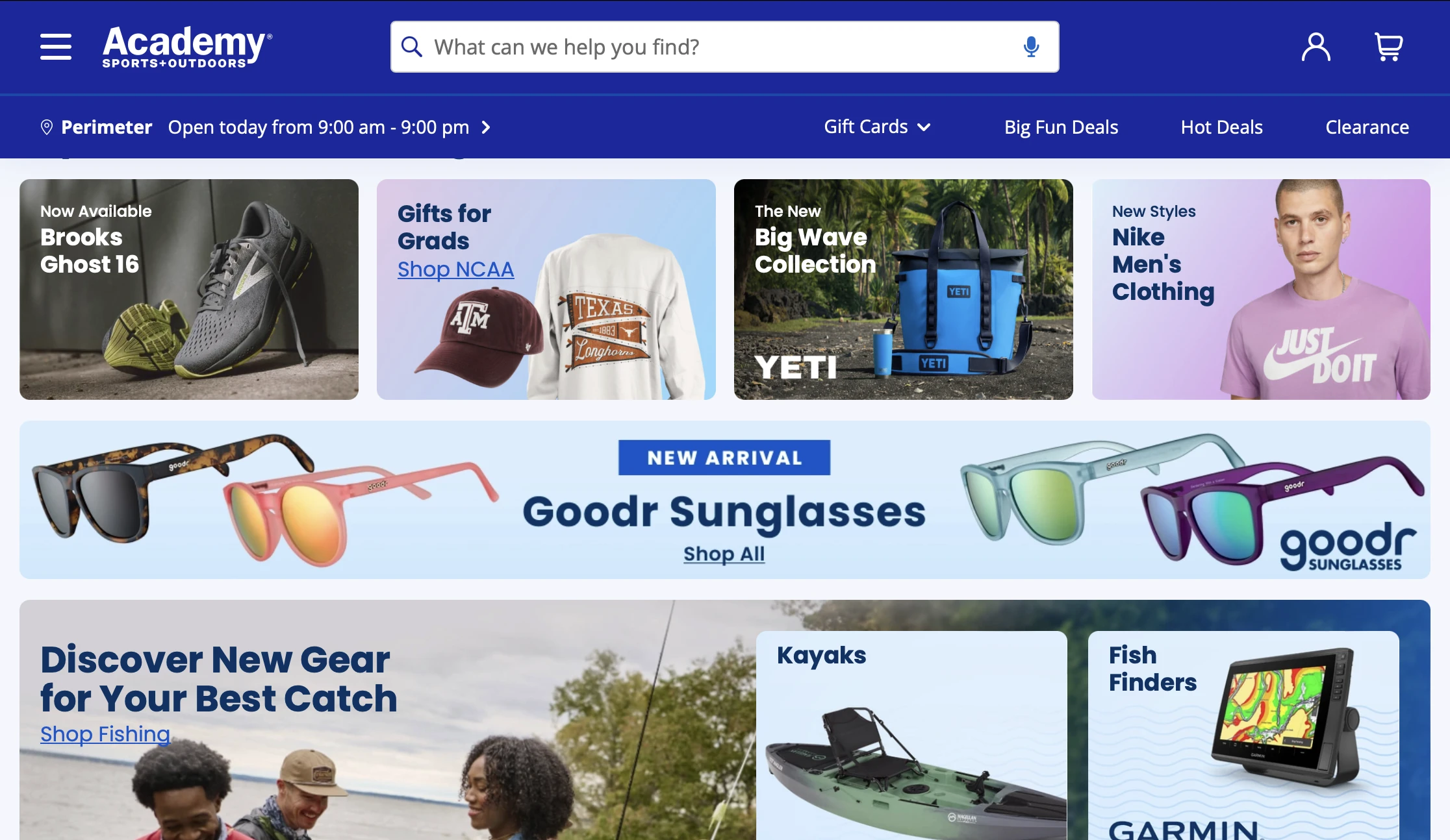
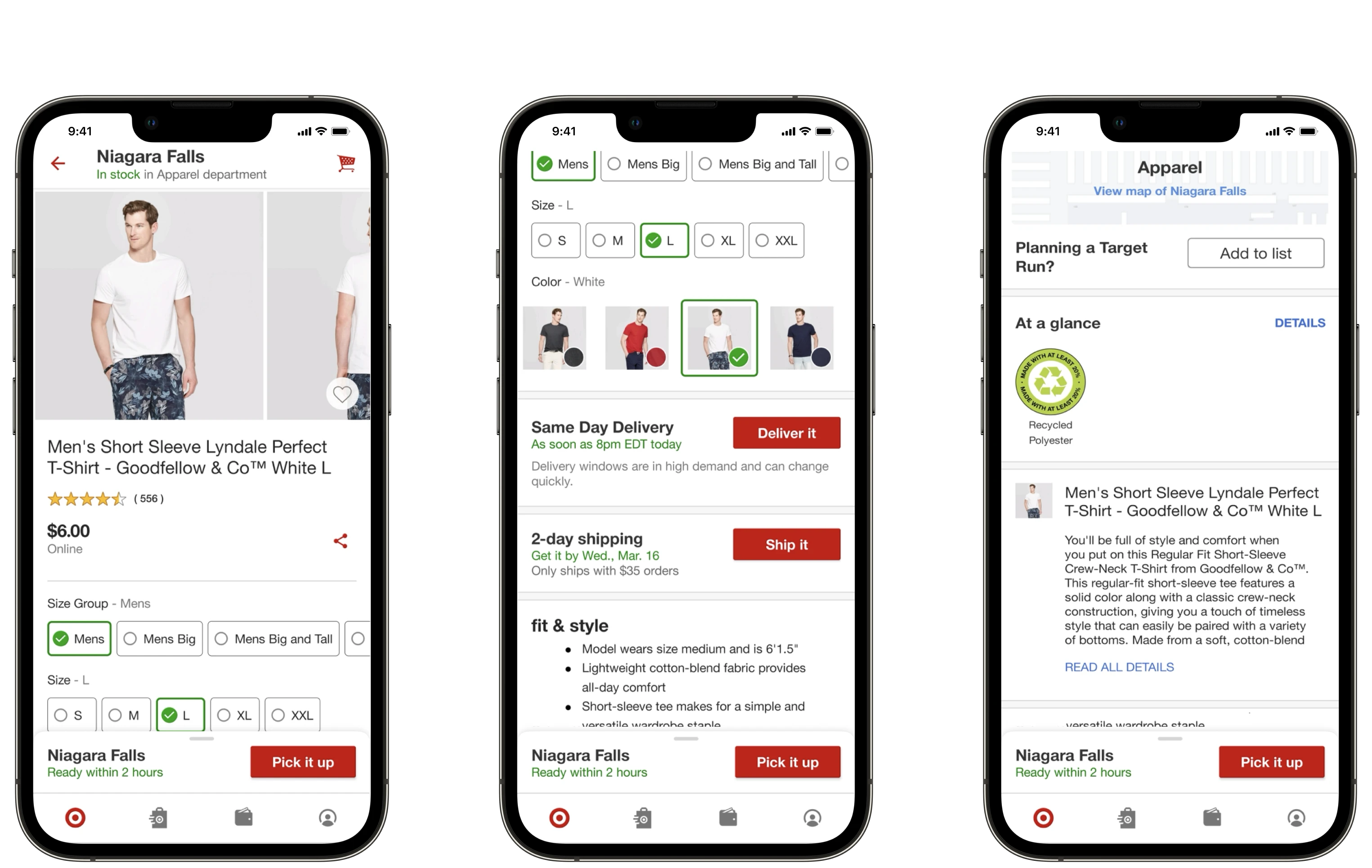
competitor research
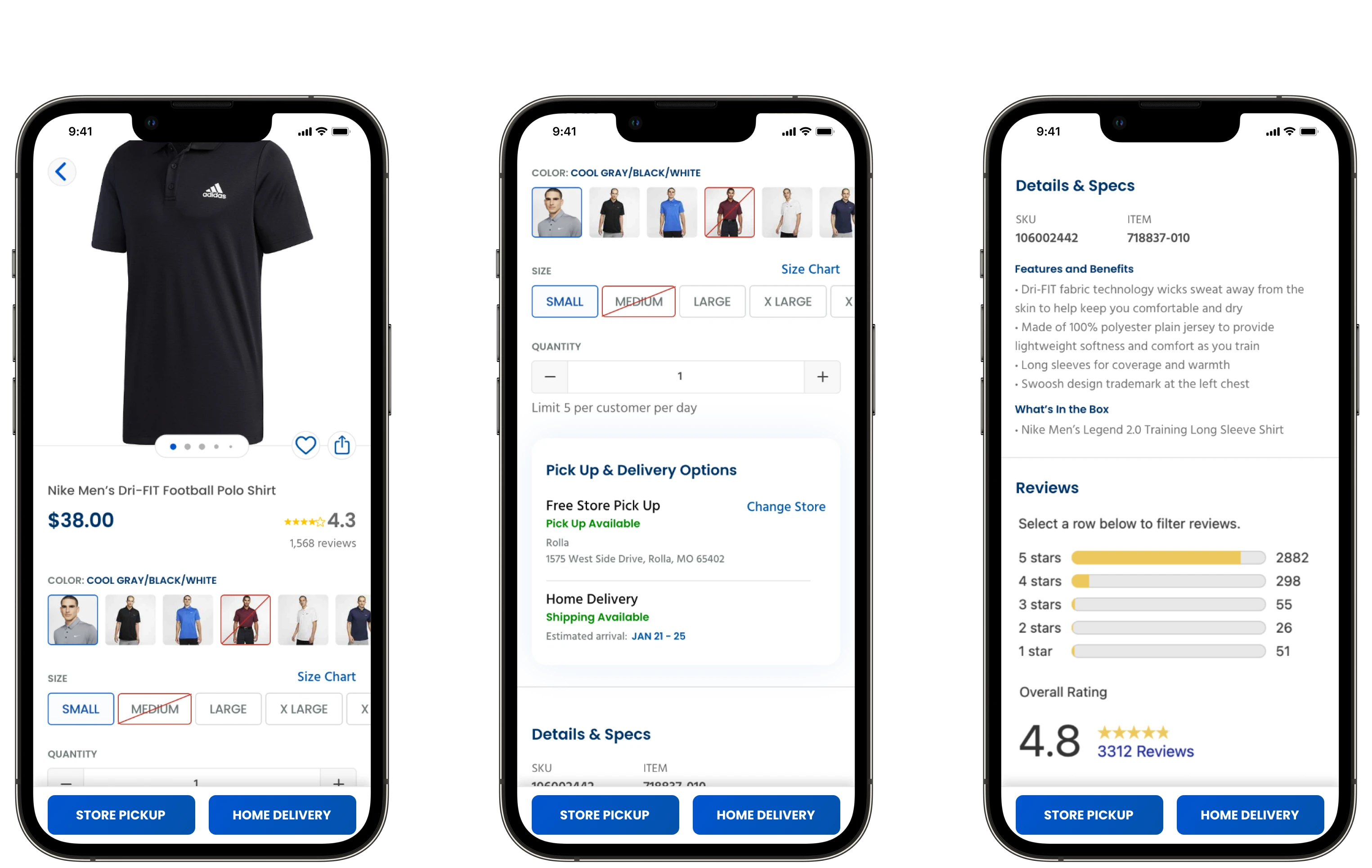
Target's PDP did a great job of exposing content
We also worked with our clients to understand who they feel are their competitors in the space. Though Dick’s Sporting Goods was their biggest direct competitor (and still is), their app was a webview of their website experience. At the same time, Target’s iOS app was consistently used as a reference for a best-in-class experience.
For the PDP, I took note of Target’s approach to expose all options and information and their extensive related products carousels towards the bottom of the page. I liked that Target never made the PDP for an item a dead-end, and hyperfocused on (what I assume to be) either their primary customer base, or the primary customer action they want to encourage, in-store pickup. The biggest negative of the PDP experience was that the reviews section was at the very bottom of the page, and hidden.
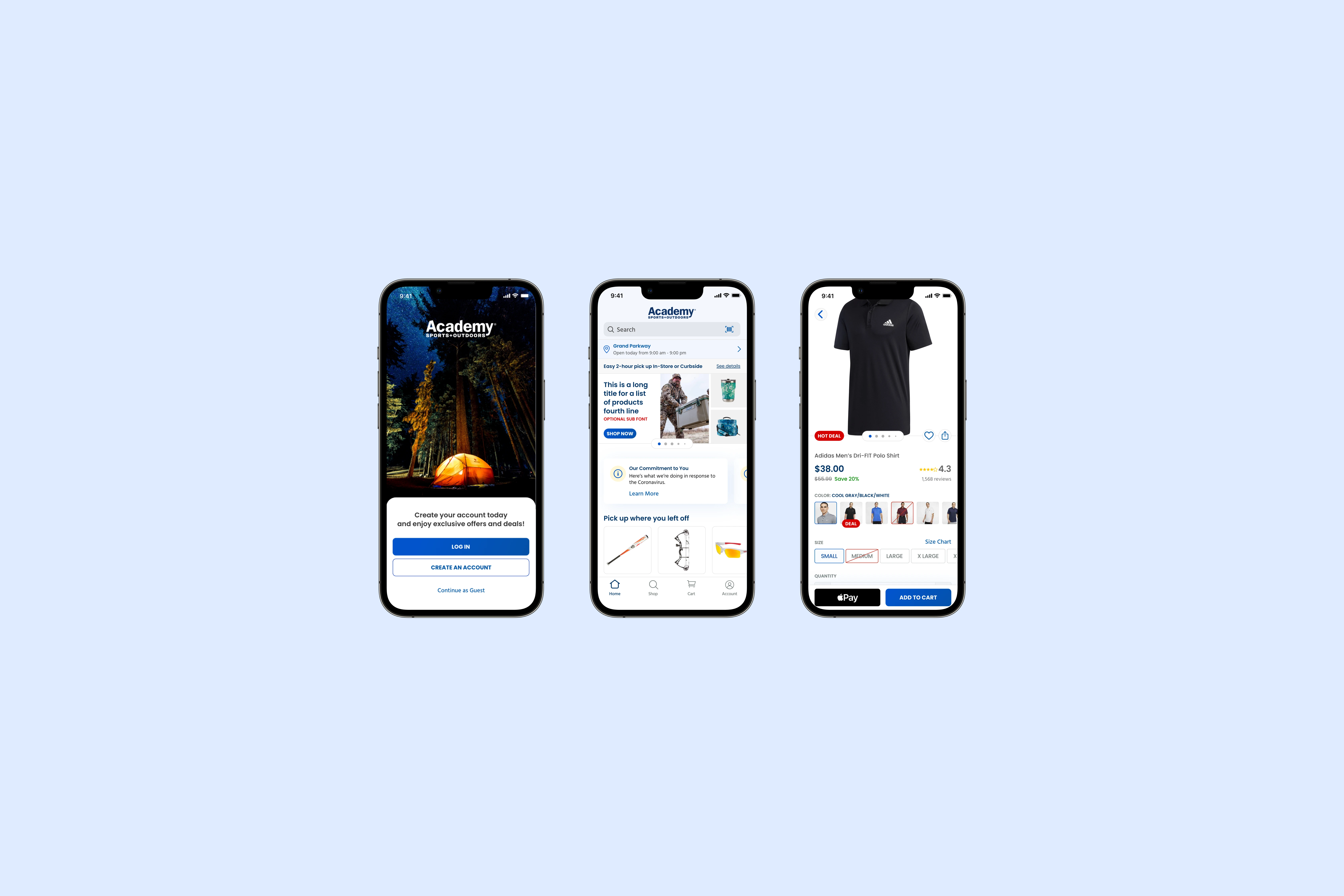
the design
Starting with the "regular" PDP
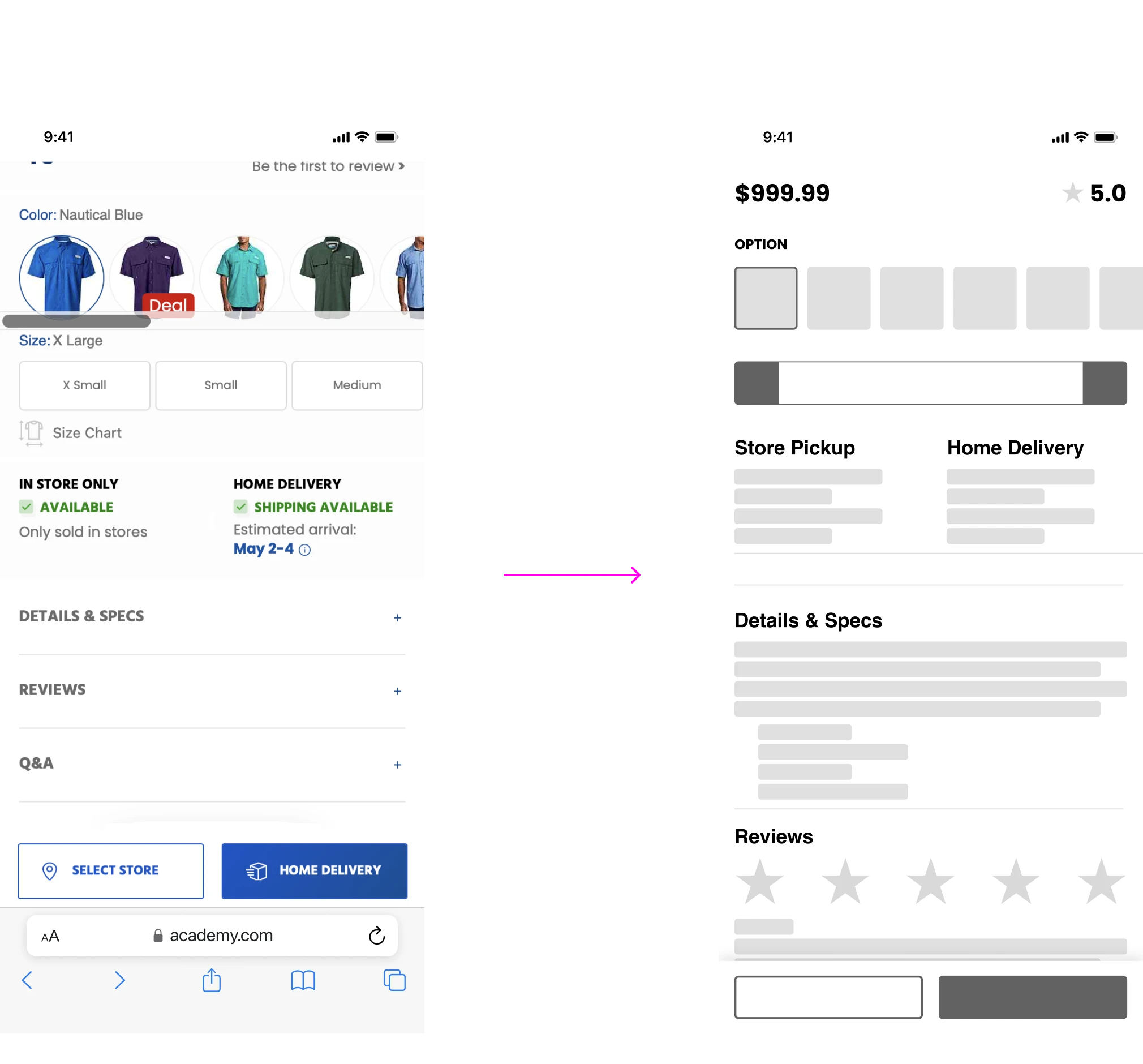
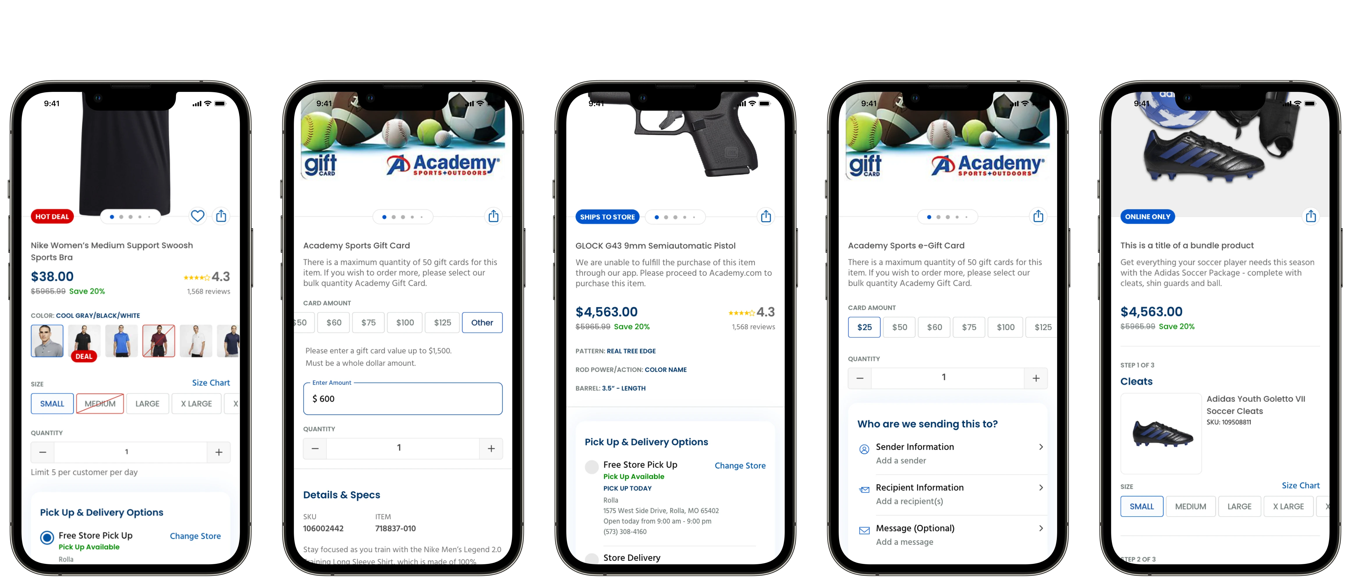
Academy supports five different product types on their website, all of which had different PDP layouts and needed their own designs: “Regular” products, gift cards, e-gift cards, bundles, and firearms and ammunition. I started with the regular PDP as this covered most products sold through Academy.
Though Academy was already doing a great job servicing their customer segments, I took it a step further and exposed product details and the reviews to let Passion Pursuers, as well as the other segments, review everything easily.
the challenge
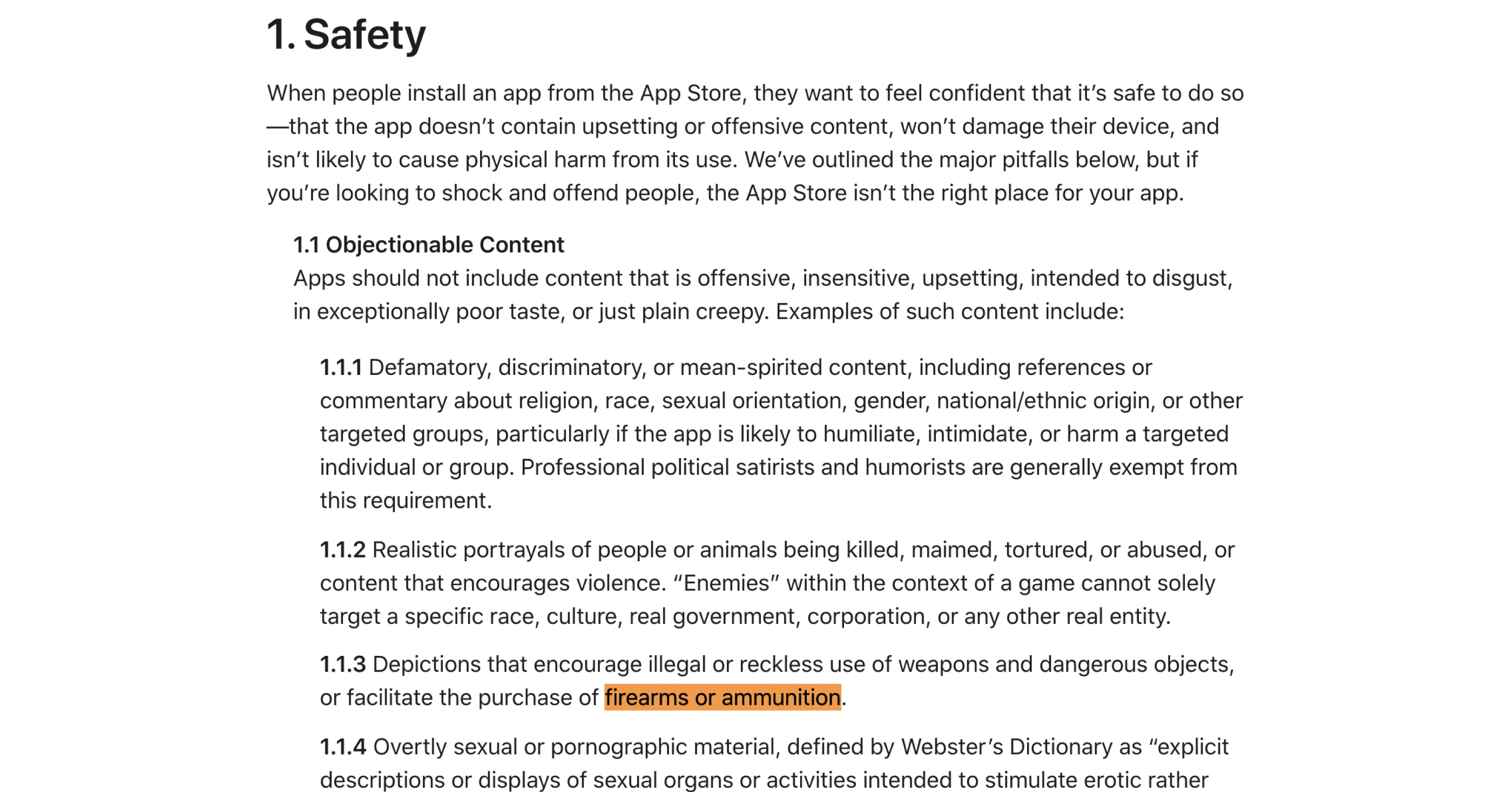
Firearms are prohibited from being sold on the App Store
After hearing that firearms were being sold on Academy’s site, I had an assumption that this wouldn’t be allowed through a mobile app, considering Apple’s strict guidelines. I found this was true after doing some digging in the App Store's guidelines.
I took this to our client and shared out scenarios where I thought we could still sell firearms, and ideally make an easier purchasing experience for our 3 segments. Some examples being: allowing customers to add firearms to cart, but continue the purchase on web; Letting customers add firearms to a wishlist. Adding messaging saying sales are prohibited by Apple. I took these examples and called Apple support, however, every idea was shut down. In addition to the scenarios I outlined, we also weren’t allowed to advertise firearms to customers.
the solution
Directing customers to the web experience
I raised the findings to the Design and Product teams as a risk to our strategy. Working with the Product team, we ideated and defined generic messaging to say firearms can't be sold in the app, and to re-route these customers to the web experience.
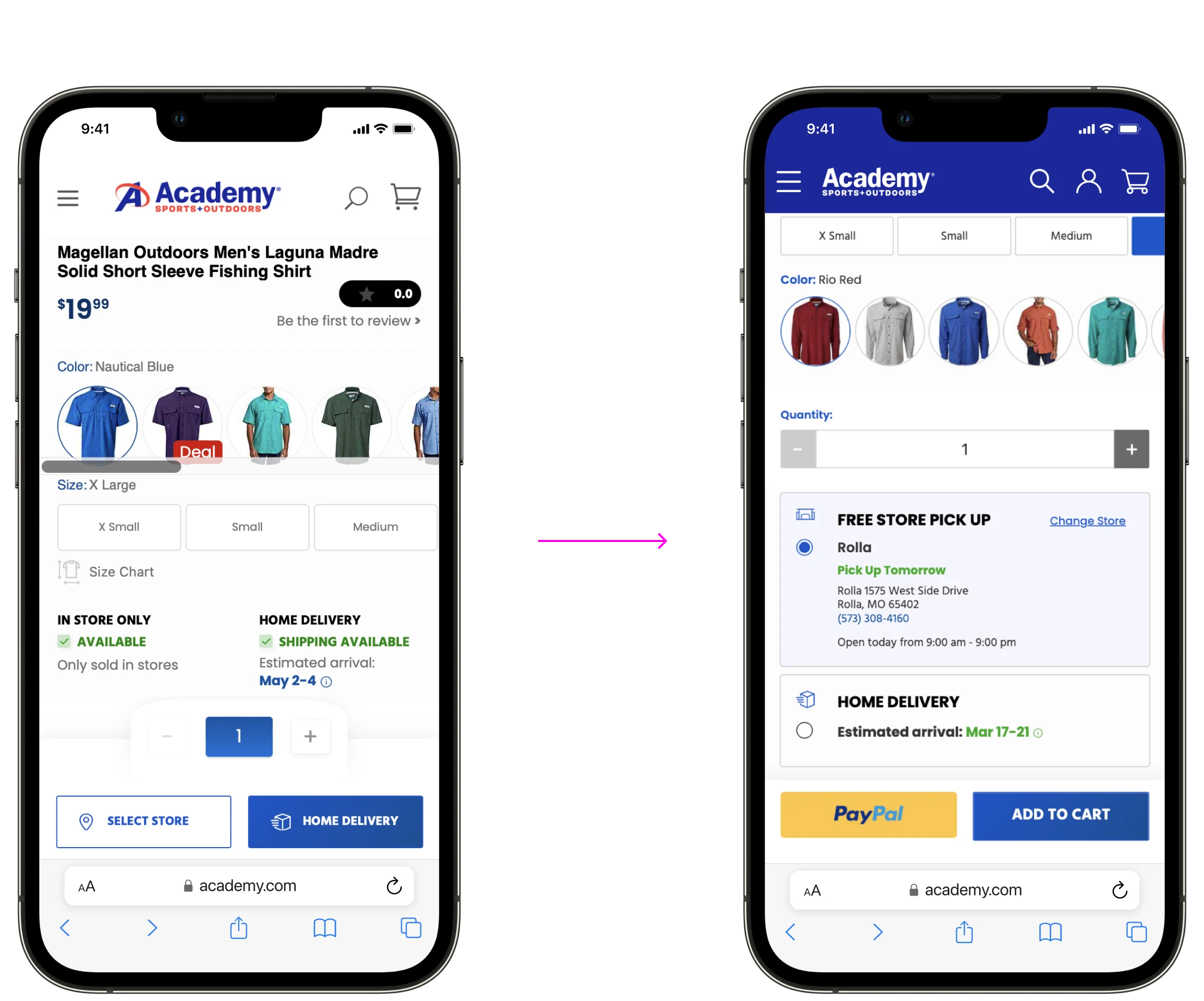
Going back to our customer segments, specifically the Convenience Chaser, I proposed to include store availability on the PDP to let them see these details before sending them to the web experience.

Deeper into the project, we learned that the design team at Academy was redesigning the web
experience.
The issue was, they also expected the app designs to comply. We had to go back to the drawing board.
the re-work
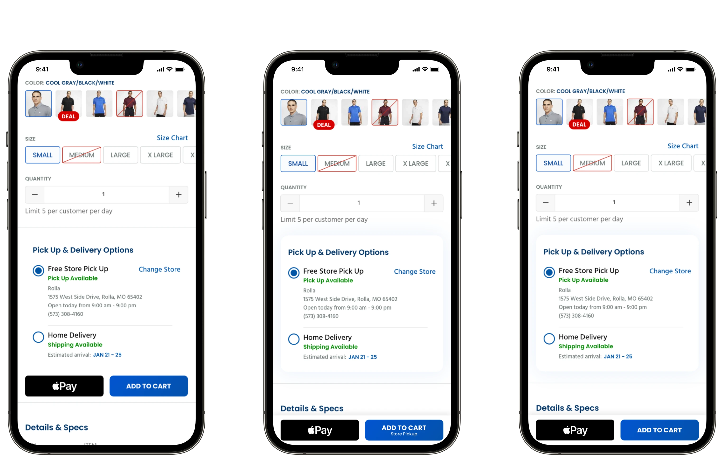
The add-to-cart and fulfillment interactions were changing
The change to the PDP was to use one sticky Add to Cart button, with another Apple Pay button beside it (PayPal on Web), and to use a radio button that defaults to Free Store Pick Up for fulfillment. I raised a hypothesis to Academy that this would impact customers, as they wouldn’t be able to see what fulfillment option was selected before they chose to Add to Cart. The biggest risk with that was if they chose to use Apple Pay and place the order right away.
inflection point
Do we proceed with a worse experience that follows web parity?
Or do we give customers what they're familiar with?
usability testing
As hypothesized, customers had difficulty with the new interaction
When asked specifically about this interaction during testing, most participants called it out as awkward. I tried to redesign this interaction and present these options back to Academy for consideration.
For my first proposal, I placed the add to cart button below the fulfillment options, so customers would be forced to scroll past them. Since we know our customer segments scroll and want more information, this would make a lot of sense.
The second proposal kept the buttons as sticky, but placed a callout in the add to cart for what fulfillment option was selected. We know Convenience Chasers want convenience, so letting them know what fulfillment option was selected would also make a lot of sense. Unfortunately, both proposals were rejected, so we proceeded with web parity on the far right.
finishing touches
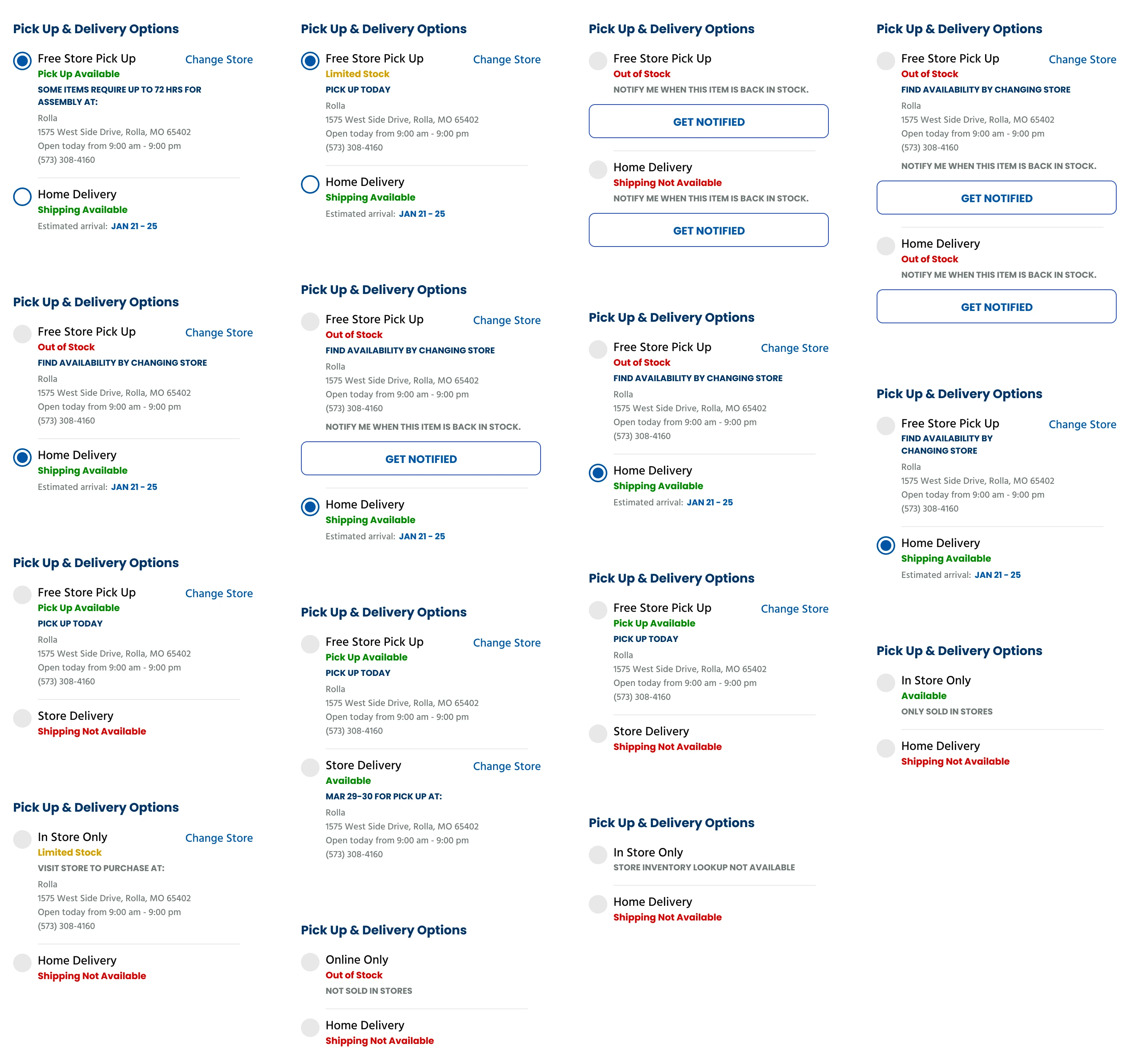
Defining all the states for the fulfillment selector
In addition to the radio buttons, I worked with our client to define every possible state that could appear, and then I designed out the component and it’s variants. This would help our development partners to ensure we’ve designed a scalable solution and accounted for all edge-cases.
Finalizing the PDP
Designing out the rest of the PDPs
Throughout the process I facilitated design reviews with the client, and we reviewed designs again once the PDP was finalized to get their sign off. I continued with designing the rest of the PDPs, the rest of which followed closer to parity and faced less push-back. This entire process, from research to working with devs, only took 2 weeks!
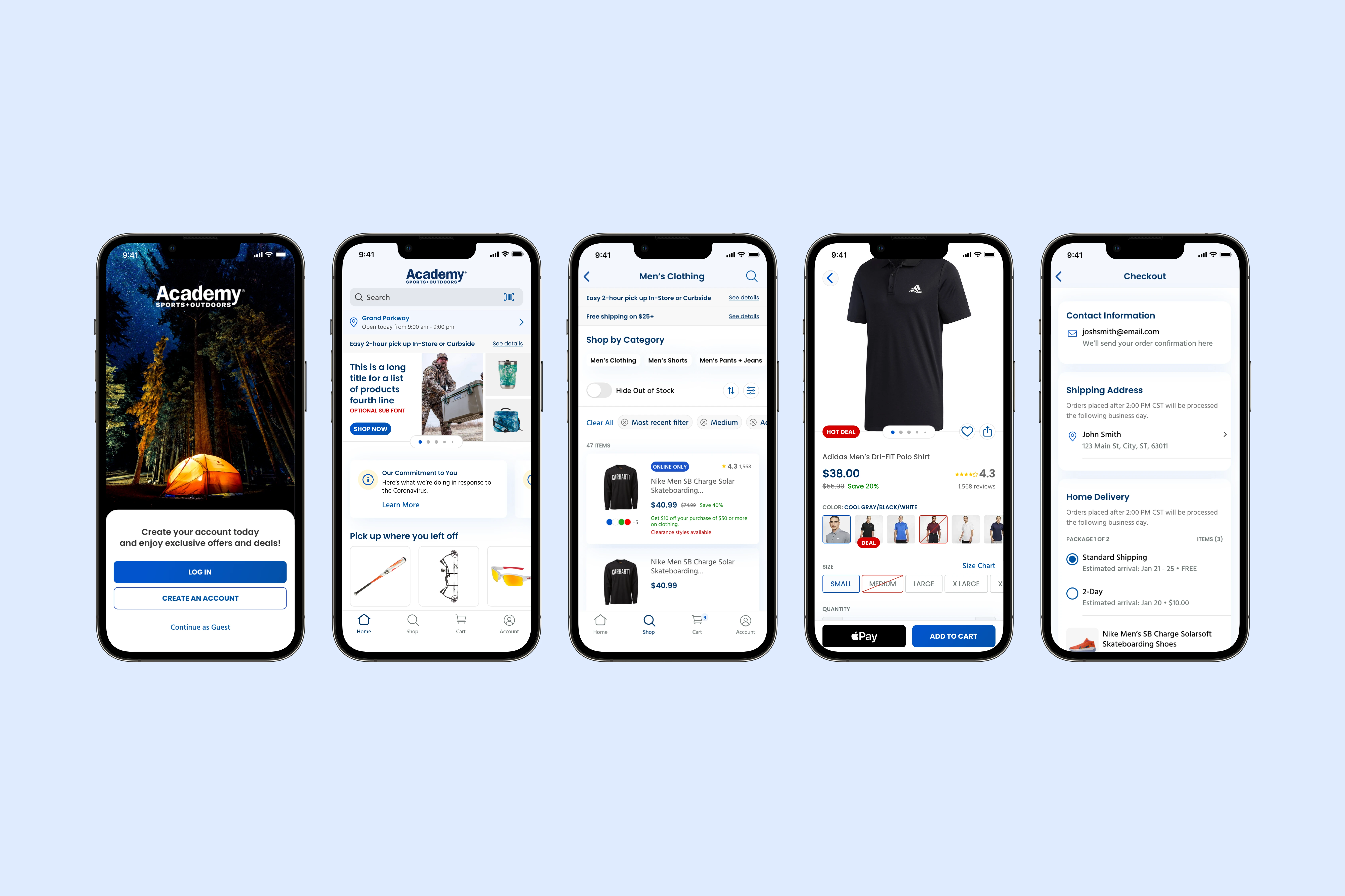
Though the PDP is what I focused on for this case study, I continued to work through other aspects of the experience, including taking on the entire checkout flow.
The launch
A huge launch for a sports giant
Within the first week of launch on the App Store, we had a 4.8 rating from over 8,000 reviewers, today this sits at a 4.9 rating from over 85,000 reviews! And also in the first week, we saw a 25% increase in average order value (AOV) over web orders. This was all achieved with $0 marketing spend for the launch.
>25%
increase in AOV over web
4.9 / 5
from 85,000+ reviews
Project challenges
We faced a few hiccups along the way
We had a lot of challenges throughout the engagement, no engagement is perfect.The tight timeline was probably the biggest challenge. 12 weeks is what we had to design the entire app from scratch. This cascaded to miscommunications, and it didn’t help that we had to go through rework since the client was redesigning their web experience.
Collaboration with the dev team was a challenge because of timezone differences. As the dev team was located in India, design decisions were communicated asynchronously, and often led to miscommunications.
Lastly, at the time, I had an Android phone, in Canada. I lacked access to many of the competitor iOS apps (Dick’s, Target) as they aren’t available in my device (though I was able to sideload the APK files). I also wasn’t able to test the QA test the Academy iOS app.
Learnings
What I learned and would’ve done differently
Baymard was a lifesaver in this project. It was helpful to quickly search for specific interactions, rather than always referring to a set of competitors to see what they did. But, looking back, there’s definitely ways I could’ve handled myself better and been more proactive. Using Figma would’ve saved our team a lot of headaches. We used Adobe XD because our client’s design files were in XD, but we didn’t need to use it. Component issues, connectivity, and collaboration were all things that affected the way we worked.
I would have proactively held meetings with the Designer at Academy to better understand what they were designing, to avoid re-work. We started doing this a bit after the PDP debacle, but I still don’t think it was enough because I faced challenges when designing checkout.
And lastly, I would’ve said “Yes” to my team offering to help with my workload. They were fantastic and super supportive, but I think I tried to take on too much at once and began to get burnt out.
Last updated [07/04/24]