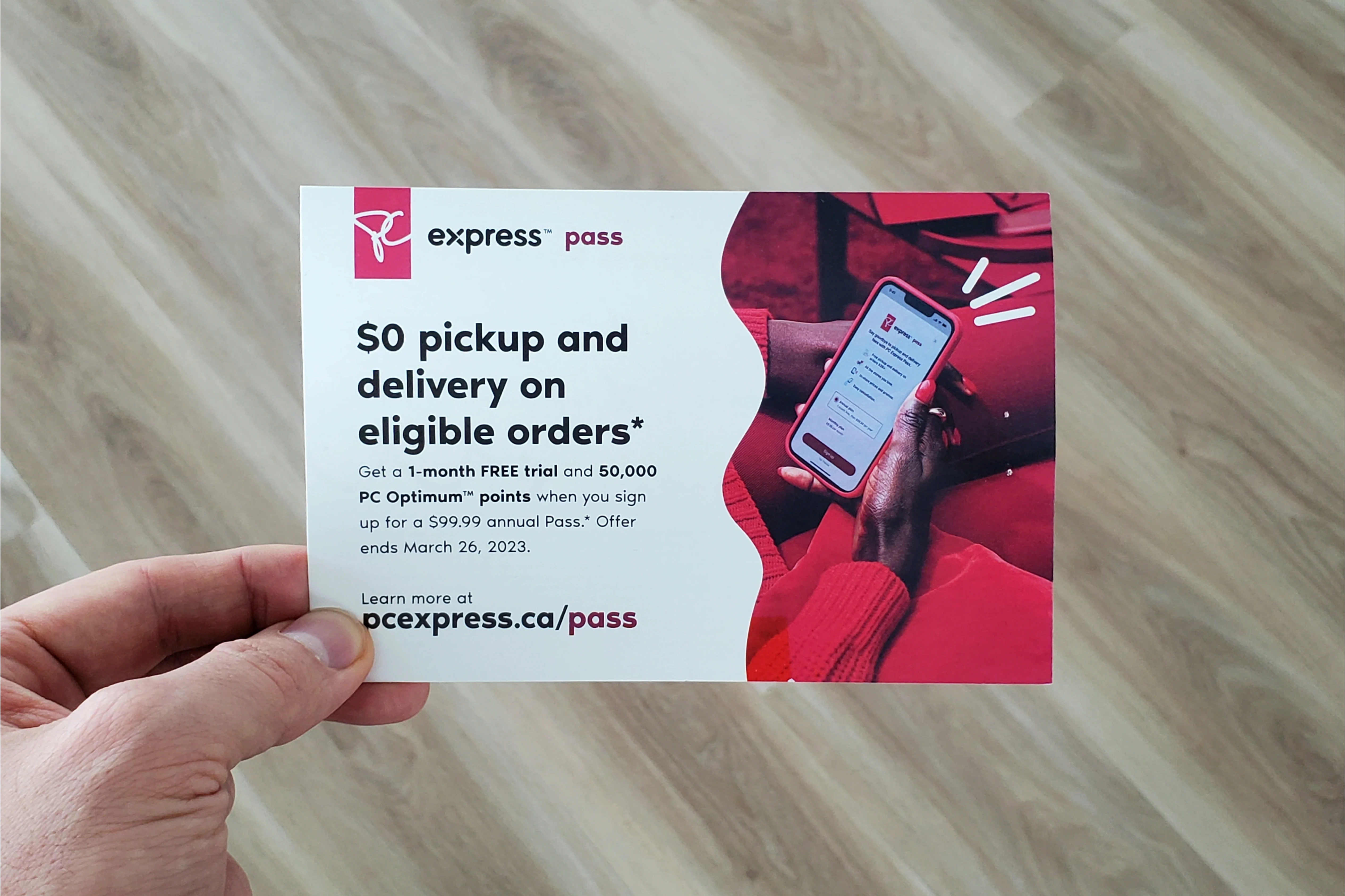
Increasing retention by removing delivery fees
Timeline: Oct 2022 - Mar 2023
Role: Product Designer
Team: Myself, Allan D. (Design Lead)
Platforms: App & Web (only app shown)
High fees were causing many delivery customers to churn from PC Express to other grocery delivery
platforms. We were losing marketshare, and losing it quick.
By launching PC Express Pass, we reversed course, and have since increased retention by 10%
year-over-year.
my role
I helped lead the design of PC Express Pass.
I was the primary product designer throughout this engagement, but I also worked closely with my design lead, Allan. I took on the journey mapping, end-to-end designs of the web and app flows, as well as prototyping and testing.
In addition, I helped function as a liaison between Product, Marketing, and Engineering teams when we needed alignment. There were aspects of the design that were owned by Marketing and Graphic Design teams, like the web landing page, so I helped connect the dots and setup sessions to align on the goals for the page and define what actions we wanted customers to perform on those pages.
Context
PC Express is one of Canada's largest grocery delivery platforms.
PC Express is a grocery e-commerce service for Canada's largest grocery chain — Loblaws. Due to it's huge reach, the service has accumulated hundreds of thousands of repeat customers and billions in sales. Why would customers choose shopping on PC Express over a competitor? Aside from in-store pricing and ~70% serviceability coverage of all Canadian households, PC Express offers earning and redemption of PC Optimum points — Canada's most valuable loyalty program.
The focus for this case study is on the delivery aspect of PC Express. We learned that our fees were high and causing customers to churn from our platform to competitors or back to in-store shopping.
the problem
Customers are churning due to high fees.
You might be thinking: if it's so successful and the loyalty program is so good, why are customers churning? The answer is high fees. When surveying existing customers, we heard that 11% mention high fees as being one of the primary areas of improvement. In contrast, when surveying customers that have recently churned from shopping with PC Express, 32% attributed their reason for leaving PC Express as high fees.
>11%
of existing customers complain about high fees
>32%
of customers churn due to high fees
the opportunity
How might we reduce delivery fees for our most loyal customers, yet still continue to earn revenue for PC Express?
the process
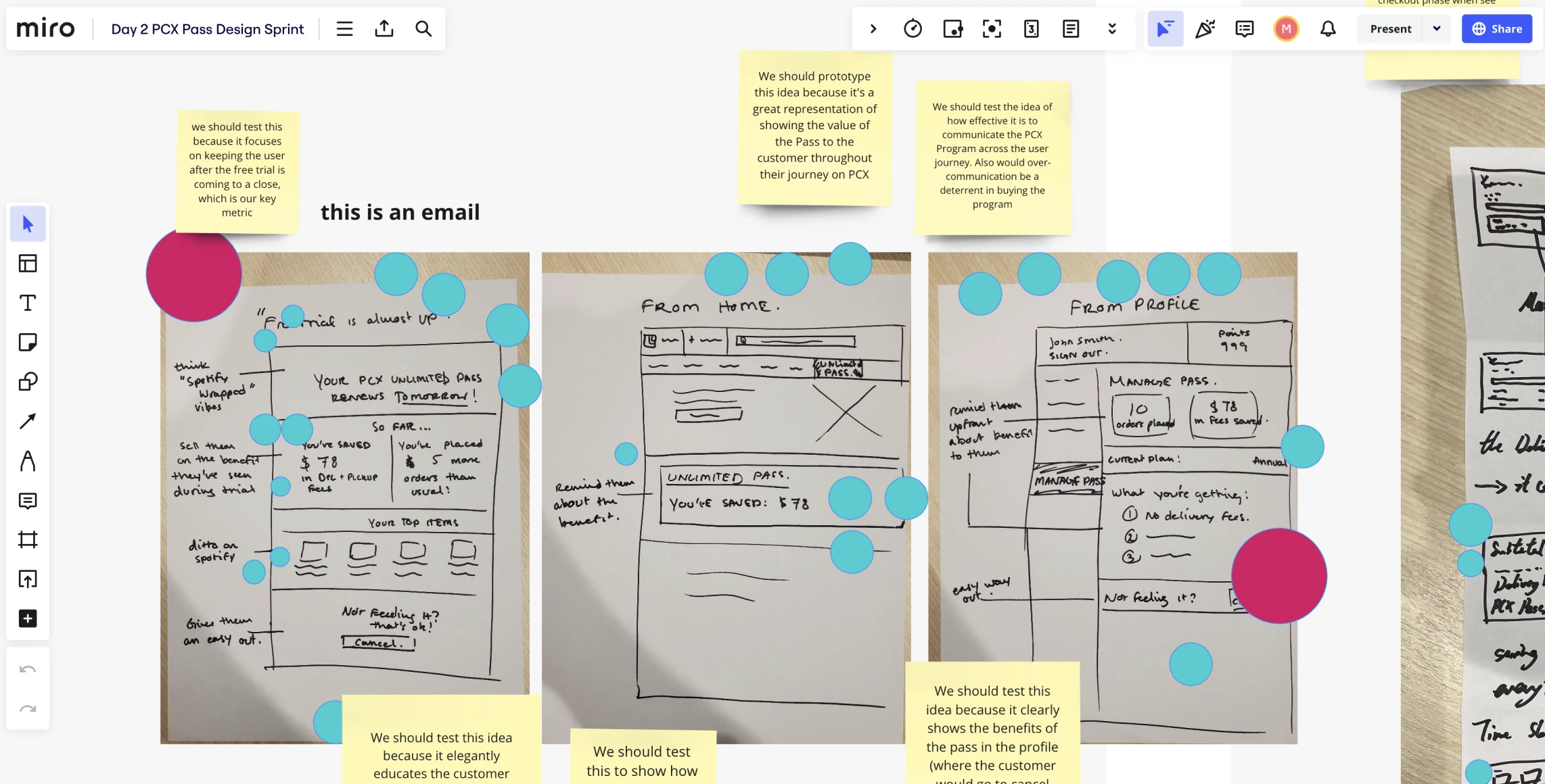
A design sprint helped kick-off the work for a delivery pass.
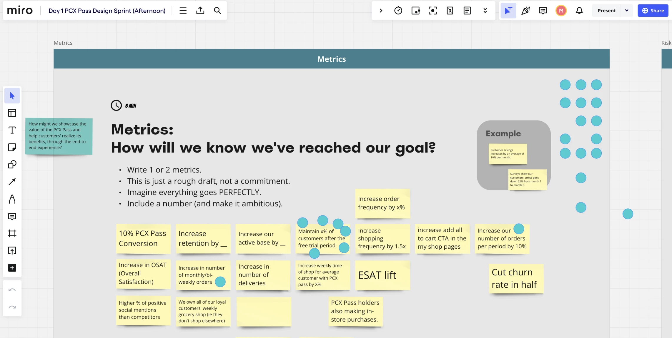
We took this opportunity into a design sprint. My design lead and I brought in folks from business, design, strategy, and development to take part. Split across multiple days, we first started to understand our competitors and what they did well, and what they did poorly. We used this to then define our core KPIs that would measure success for the program. As a team we then started to sketch, and what emerged were 3 key aspects of the customer journey.
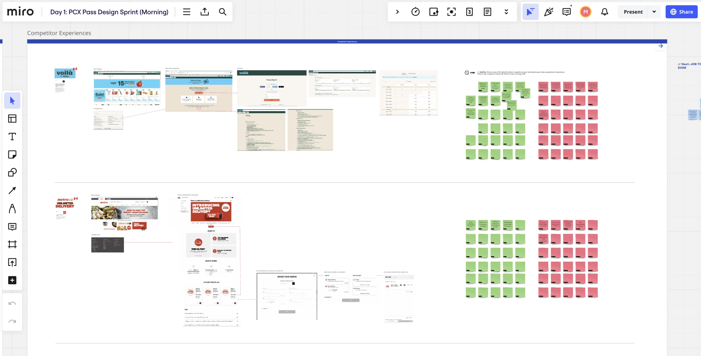
the process
Key aspects of the journey
My design lead and I took these learnings into a design sprint and narrowed the customer journey to 3 core aspects: discovery, the core sign up experience, and managing the subscription (post sign-up). For each part of the stage, we had a tenet that we followed to hold us accountable and ensure we were solving the right problems.
1. discovery
Customers should easily discover the Pass program
2. sign up
The sign up process should be frictionless
3. management
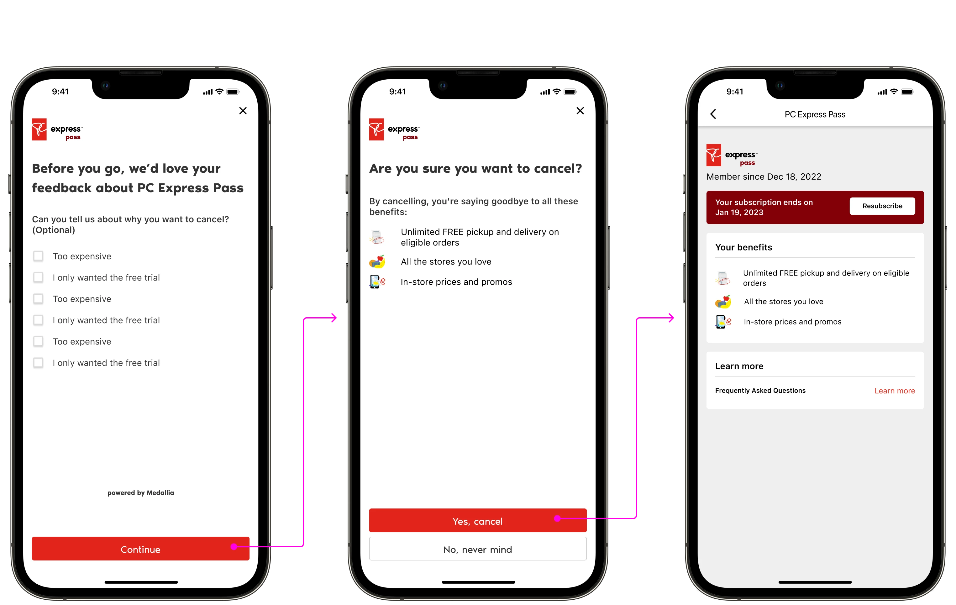
Cancellation should be easy to find and do
discovery
How might we make customers aware of the program?
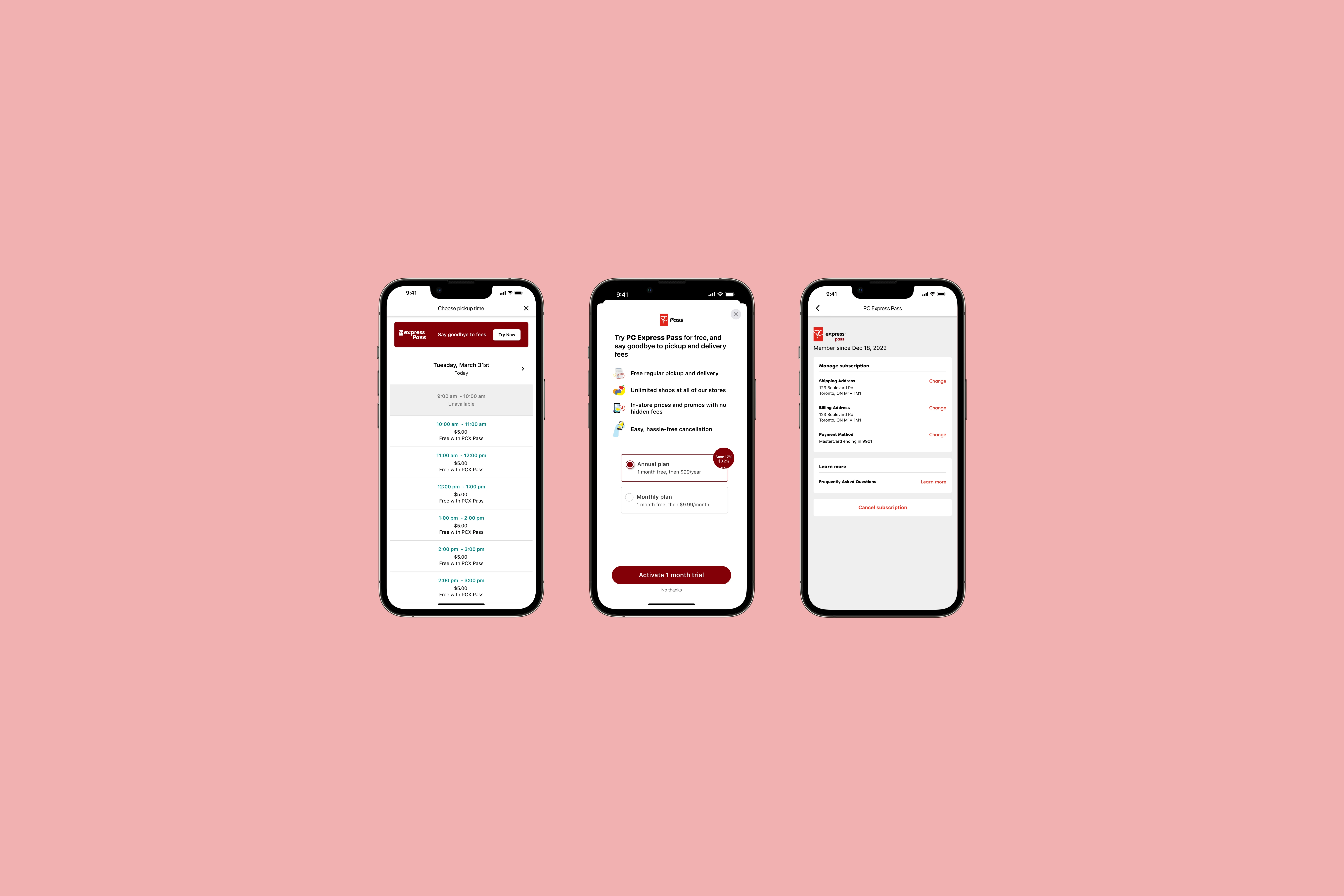
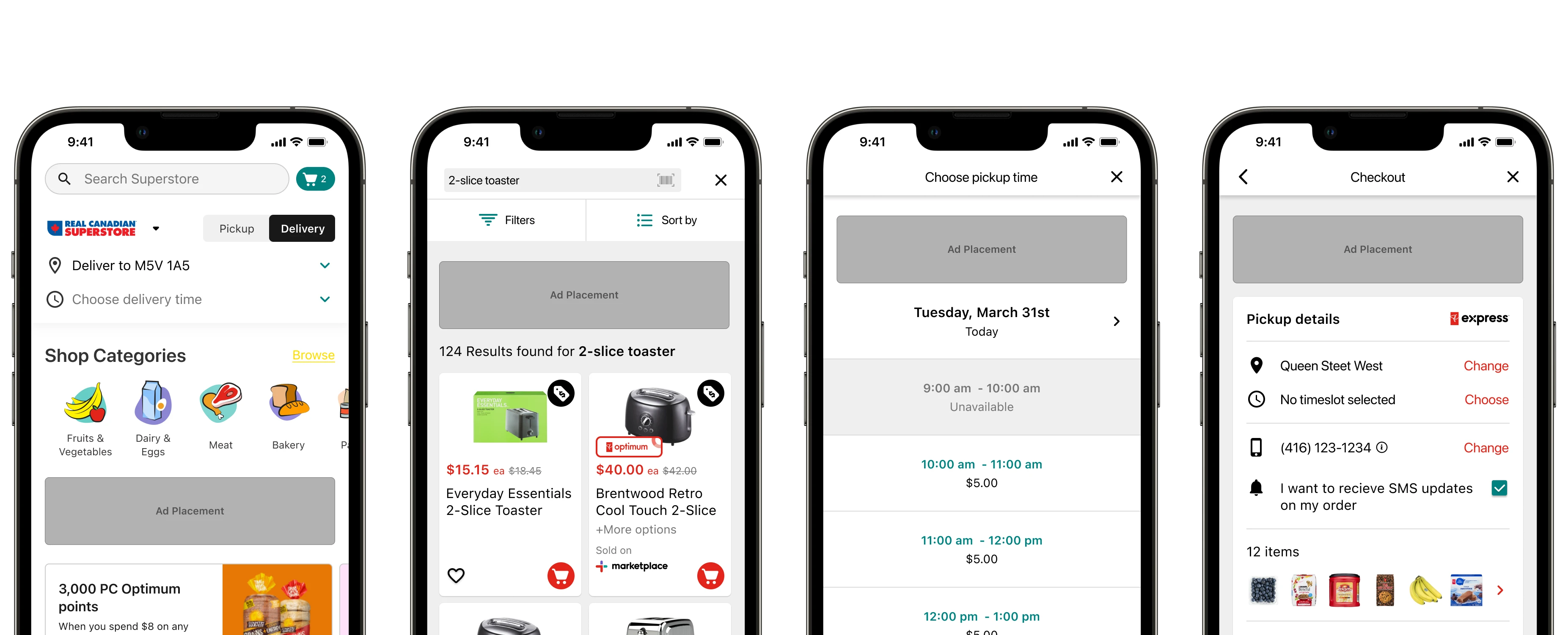
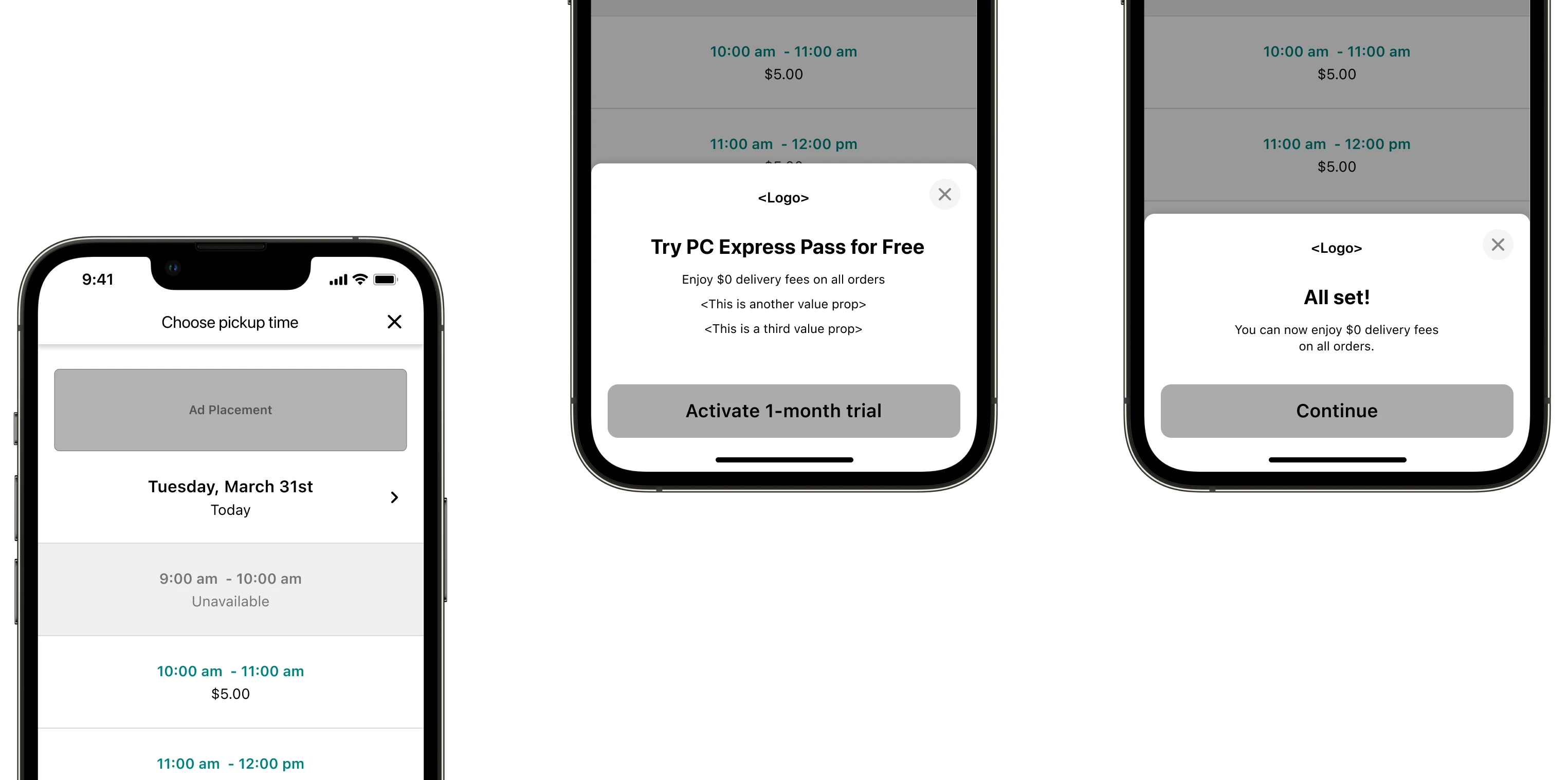
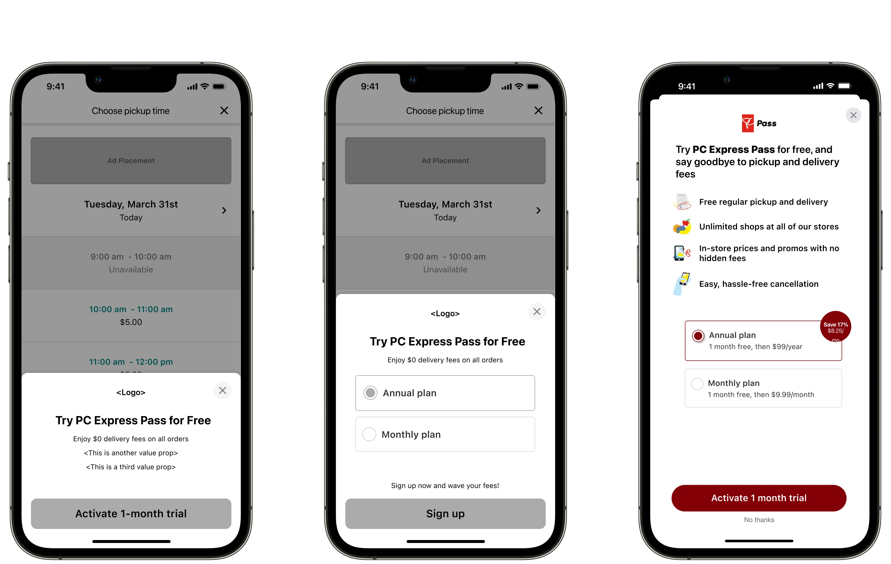
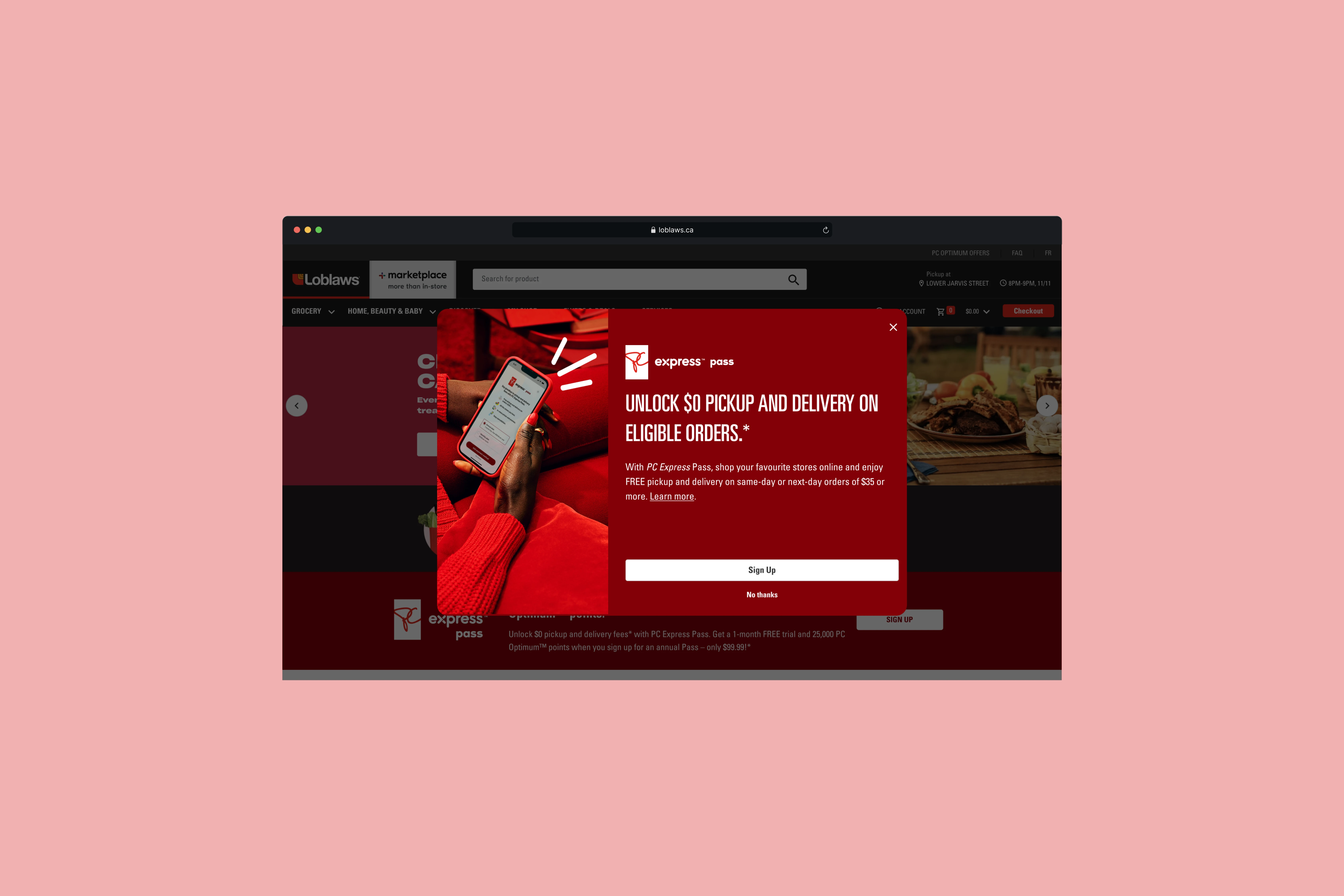
Focusing on the first tenet, Discoverability, we knew one way to get customers’ attention was through ads. I called out that the most important parts of the experience to include these ads were at timeslot selection and checkout, as this is where customers are most aware of the fees they’re paying. At the same time, the end of the funnel shouldn’t be the first time they hear of this program.
Sign up
How might we create a frictionless sign up?
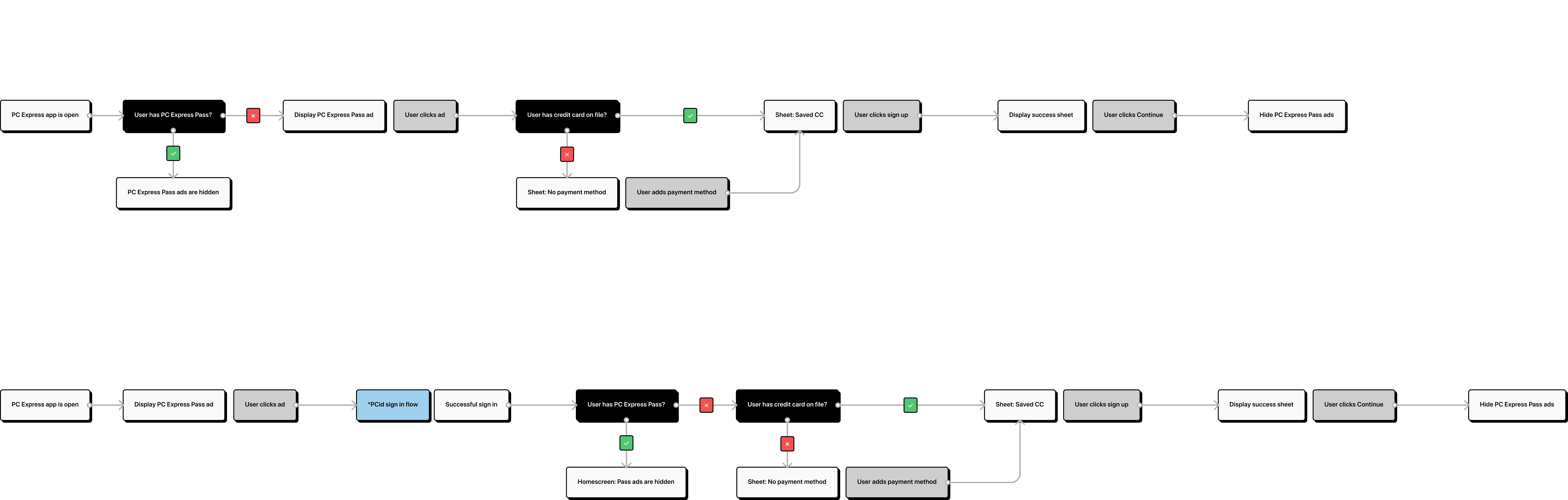
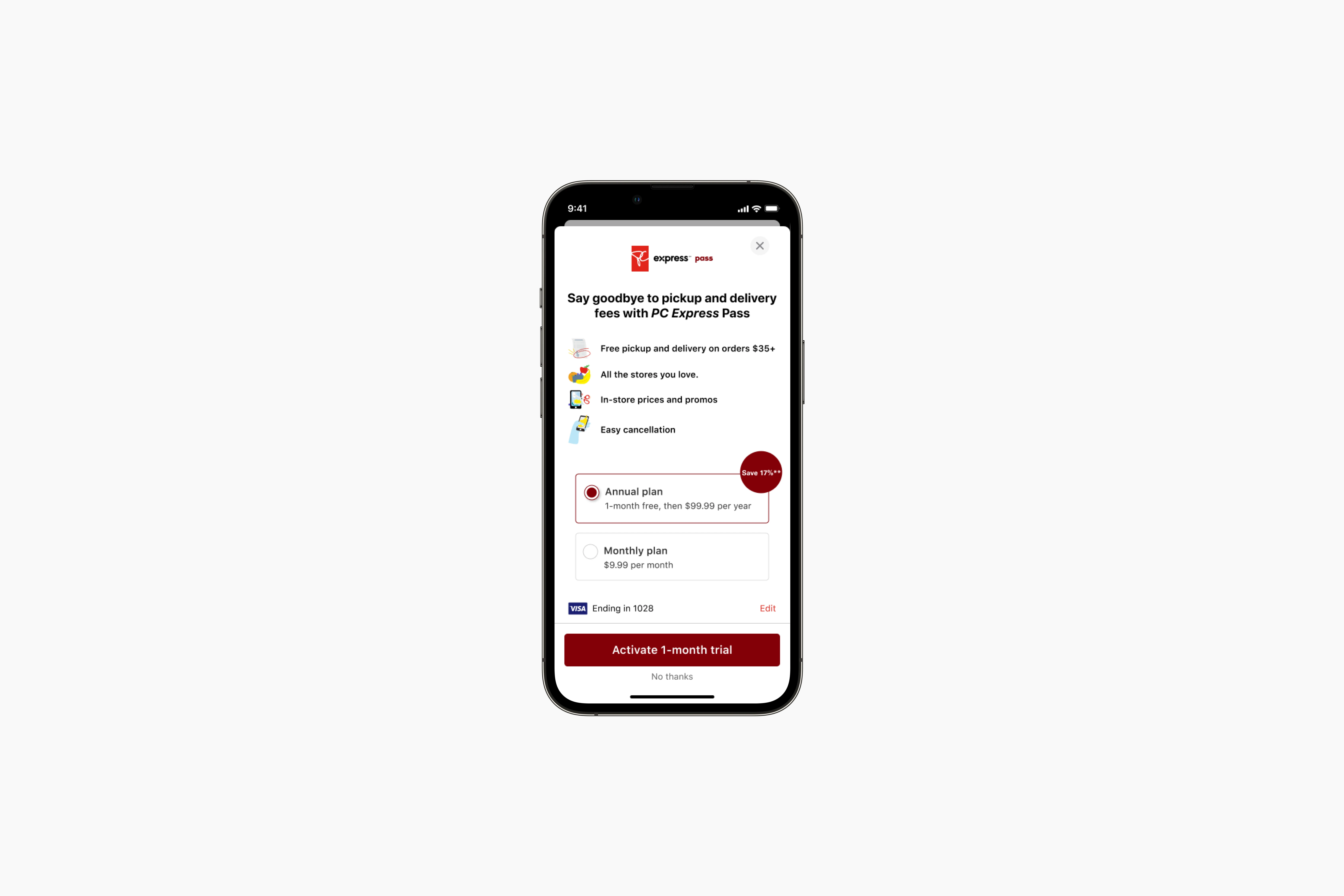
For the second tenet, I wanted to minimize the steps it took to sign up, so customers could get back to shopping for groceries. I designed the flow to be launched on-click of the ads throughout the experience, and have the annual subscription pre-selected once that screen opens.
Since this subscription would likely appeal most to existing, repeat customers, their credit card information would be saved. Thus the resulting flow is simply tapping the ad and pressing sign up to continue.
"What are the benefits to signing up?"
- customer feedback from testing
Though the sign up flow was lean, we heard that customers were having trouble learning what the program was about. Maybe we were too lean. We surfaced the value propositions for Pass in the sign up modal to help with comprehension.
Management
How might we make it easy to cancel?
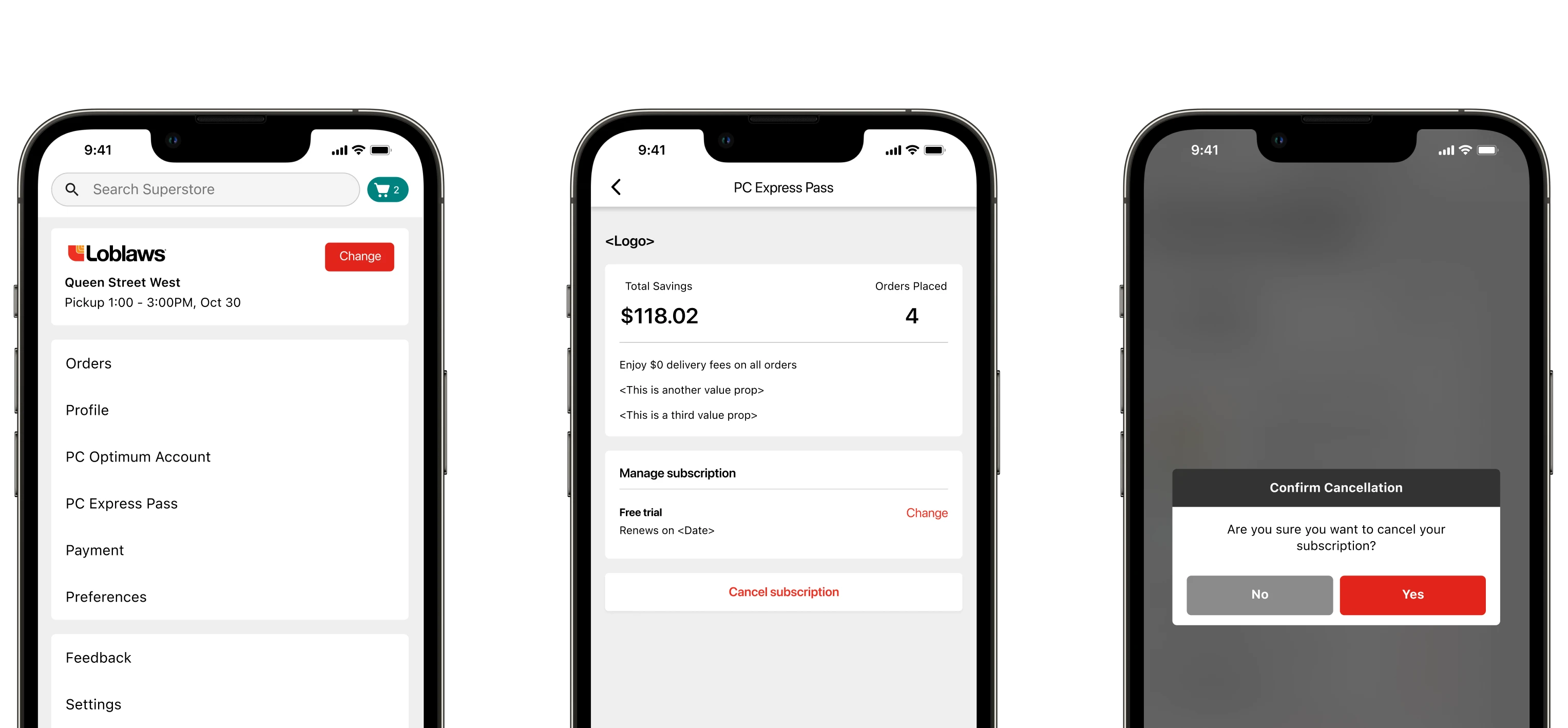
Lastly, for having a simple manage process, this primarily meant to make cancellation as easy as possible. Since we expected all the information to be stored within the customer’s PC Express profile (using their saved credit card), I designed the only functions within the subscription page to be the option to switch plans and the cancellation button.
After we had finished the happy path flow, the developers took a deep-dive into the tech to build
it.
Unfortunately, we found out our frictionless sign up flow was about to get a lot of friction.
The challenge
Due to tech constraints, customers had to re-enter credit card data.
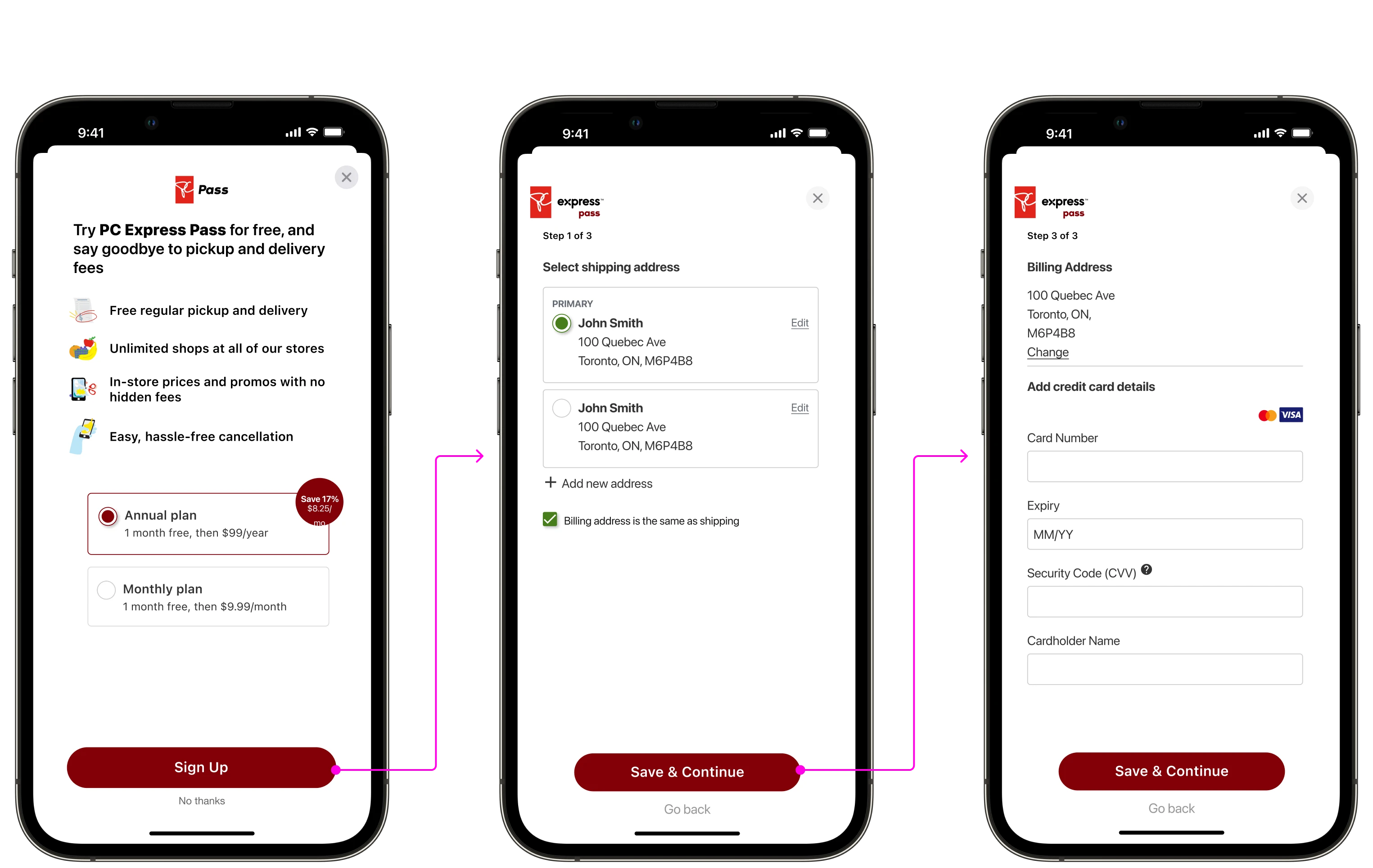
Part way into tech discovery, our dev teams learned that our current payment systems didn’t have the capability to charge credit cards on a recurring basis, so we had to use a third-party vendor; something we learned way too late. This meant that customers would have to enter their credit card information for the program to be stored in the third-party’s backend system, even if they frequently shop with PC Express and had a credit card saved in checkout.
For tax reasons, we also had to ask for shipping address fields (bruh!), which doesn't make sense in the context of a subscription... I designed and proposed a solution where we could use the customer's saved addresses on file, to fast track them through the process.
The solution: Sign Up
We couldn't proceed with the proposed designs, but it wasn't a big deal.
Though I was upset with the approach, what I found after testing was that none of the participants actually mentioned this as being a negative part of the experience when signing up — even after being asked about the form fields. After reporting this to our stakeholders, the business team concluded that customers would likely still be motivated enough to remove fees from the experience, even if it means to spend ~30 seconds to enter in their credit card details again.
The solution: Management
Management screens needed to be updated too.
These changes impacted the management screens as well, as we had to store address and card details there. Due to these changes in scope, we had to cut scope for launch, such as the savings calculations and the ability to change plans post-sign-up (this was added back soon after launch).
Understanding why customers cancel.
Post launch, we expected some customers to cancel, but we wouldn’t have known why. I worked closely with the research team to define a survey to collect data on cancellations. I designed the flow for displaying the survey after the customer completed the cancellation, but we anticipated customers to just close the survey and skip it once the cancellation was complete, so it was moved before. The risk we ate with this was having customers complete the survey but not complete the cancellation.
preparing for launch
I worked through the communications strategy to spread the word.
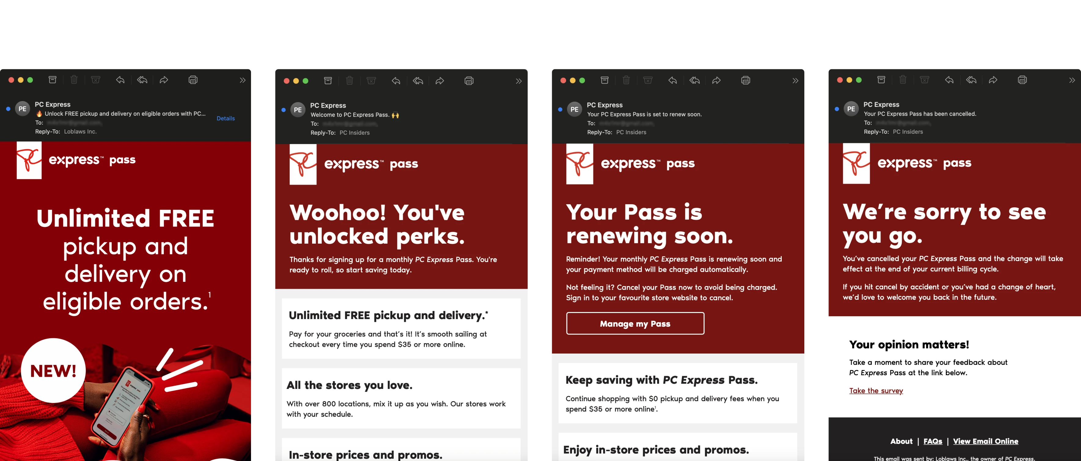
Once the designs and value props were finalized, I worked closely with my PM to define the email communications for PC Express Pass. We defined 4 email-templates to capture the initial launch, confirmation of sign up, renewals, and cancellations. After the MVP launched, our growth and graphic design teams worked to expand the marketing emails.
The logic for the emails was simple: the initial launch email was set to go out to all PC Express customers on the launch day, and just included a link to sign up and callouts for the value propositions. The confirmation email went out once a customer successfully signed up for the Pass; similarly, the renewal email went out after a monthl or annual subscription renewed. The cancellation email went out after a customer cancelled.
The launch
A successful launch, for a challenging project
PC Express Pass went live in March 2023, and since then, we've accumulated over 109,000 subscribers at an over 21% conversion rate. In total, we've been able to save customers over $9M in fees. For our most important metric, being retention, we've observed a 10% increase in retention year-over-year! And as expected, our best performing ad placement was in the latter half of the funnel, specifically in cart.
>10%
increase in retention year-over-year
>$5M
in incremental revenue
>21%
conversion (>100k subscribers)
Project challenges
It takes a village...
As I mentioned, it all kicked off with a design sprint. Representatives from marketing, UX, business, and development were all involved in the kick-off for the project, and I was the primary product designer on the initiative until it’s launch, with assistance from my lead, Allan. Though this seemed like a lot, this project then blew up to include heavy involvement from legal, PC Financial, our third-party vendor, and more effort from marketing than we initially imagined.
Now, how was this a challenge? Well, how was it not? Finding calendar times, gaining alignment from so many people on the smallest things, coordinating communications between legal teams, marketing and UX teams, and much, much more.
In retrospect, I don’t think there really is a way to solve for situations like this. Though Loblaw Digital operates like a startup, it still is under the Loblaw parent company which operates like not-a-startup… Large launches will require large engagements.
Learnings
Growing as a designer
I had to do a lot and wear a lot of hats on this project. This might be the least UX-artifact-heavy project I’ve worked on, but somehow it felt like the most? I worked a ton with our marketing teams because content was so important on a project like this. We always had to make sure what they were sharing in ads and media matched what we were sharing in the experience to our customers.
Closely partnering with development was a must as well. We always had impromptu calls and deep walkthroughs of flows and rules for things in the experience. Throwing in the third-party layer as well, it brought us to empathize with each other as it was a service we were all new to and had to learn.
That stuff being said, I think my biggest learning was just working with a lot of different teams and getting to know a lot of people. I made great friends on our marketing side after being down and dirty in this project and I’m very thankful for it.
Last updated [07/04/24]