Improving grocery substitutions
How I aligned teams and designed a simple approval process which saved millions in operational costs.
Case study · Oct 2023



Overview
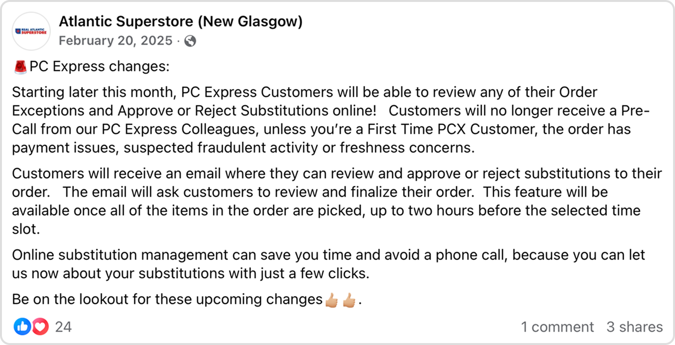
PC Express is the e-commerce brand for Loblaws, Canada's largest grocery chain. Millions of customers depend on the service for their day-to-day grocery pickup and delivery. Unfortunately, as is the nature of e-commerce, items can't always be guaranteed and therefore substitutions happen to mitigate the situation of customers not receiving anything at all, yet at the same time, still allowing the business to make a sale.
Back then, substitutions were an extremely manual process for both customers and the business. If an item wasn't found during picking, a substitute was selected (process of me picking shown below during a store visit with the team), and then the customer would be called an hour prior to pickup. If the customer didn't want the item or wanted something else, however, the store employee would have to go through that same process again (like me, below) to make those changes.
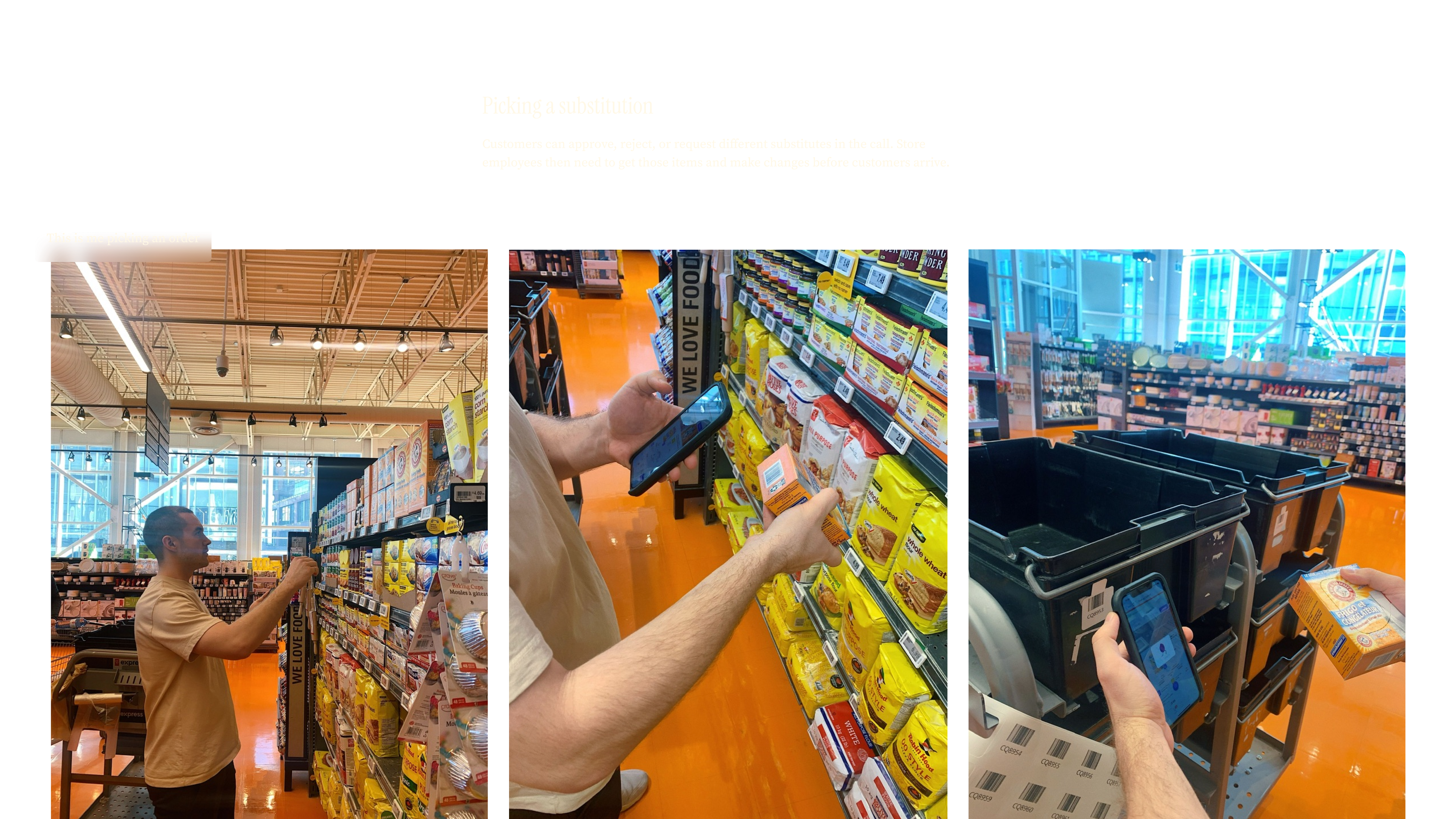
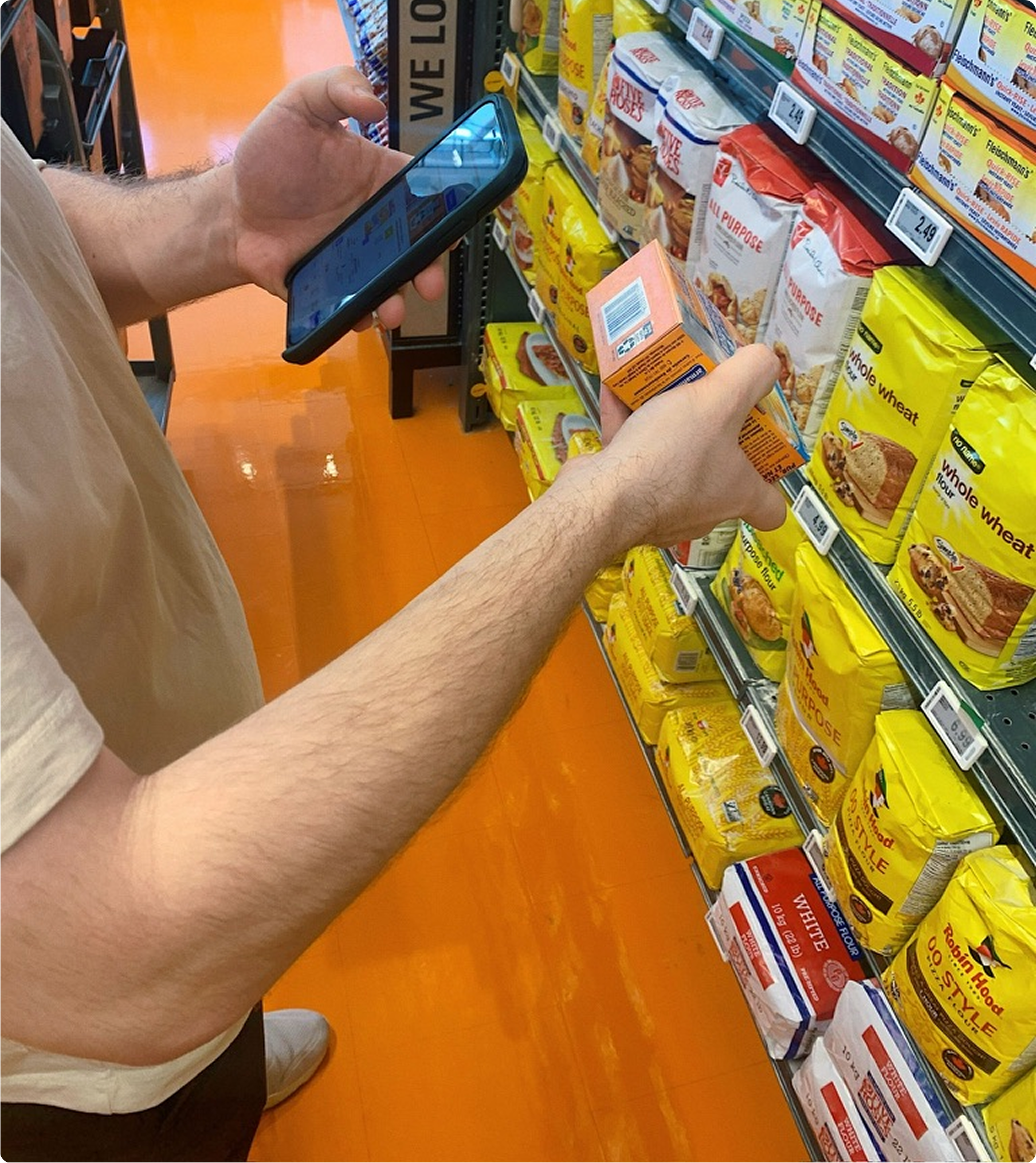
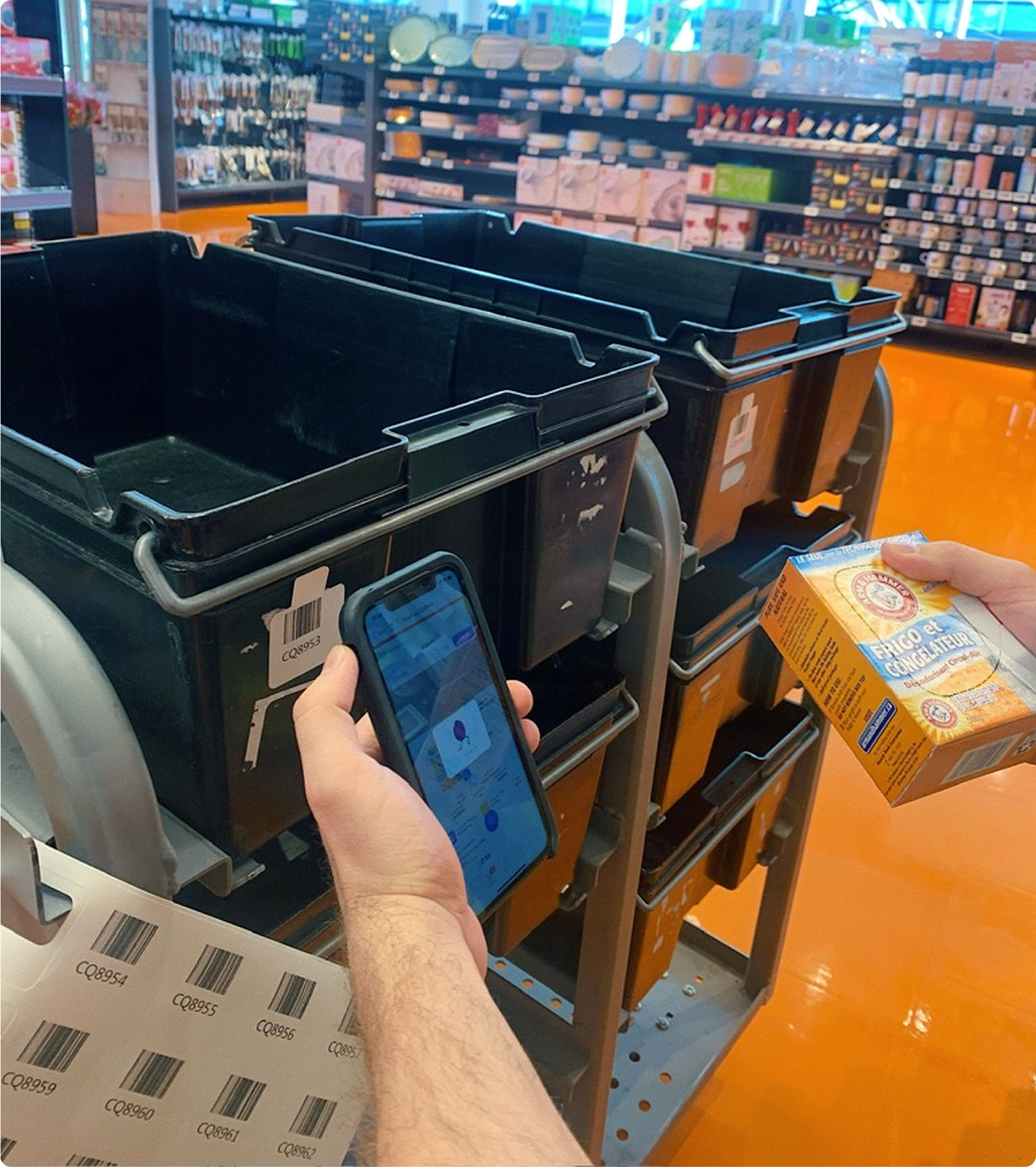
I was a Product Designer on the growth team for PC Express, and I led the design for this feature that enabled customers to review their substitutions digitally instead of over the phone. The project ran end-to-end from discovery and workshopping through design and launch, and it resulted in significant operational savings and strong customer adoption soon after release.
In just 6 months:
Over 60% customer adoption of the feature
Over 60,000 labour hours saved
Over $3M in projected annual cost savings
* * *
Substitutions caused a lot of churn
Though substitutions presented a great opportunity for customers to still receive grocery items, it was happening far too frequently. Data showed that 20% of customers that churned attributed their primary reason as too many substitutions.
Digital experiences were read-only
To mitigate this stores send emails and even call customers prior to receiving their items. Though customers love the call, Operations teams call it inefficient. The call gave customers the flexibility to request new items entirely, which required employees to go out to the store and pick those items sometimes minutes before the customer arrives for pick up (as I alluded to above).
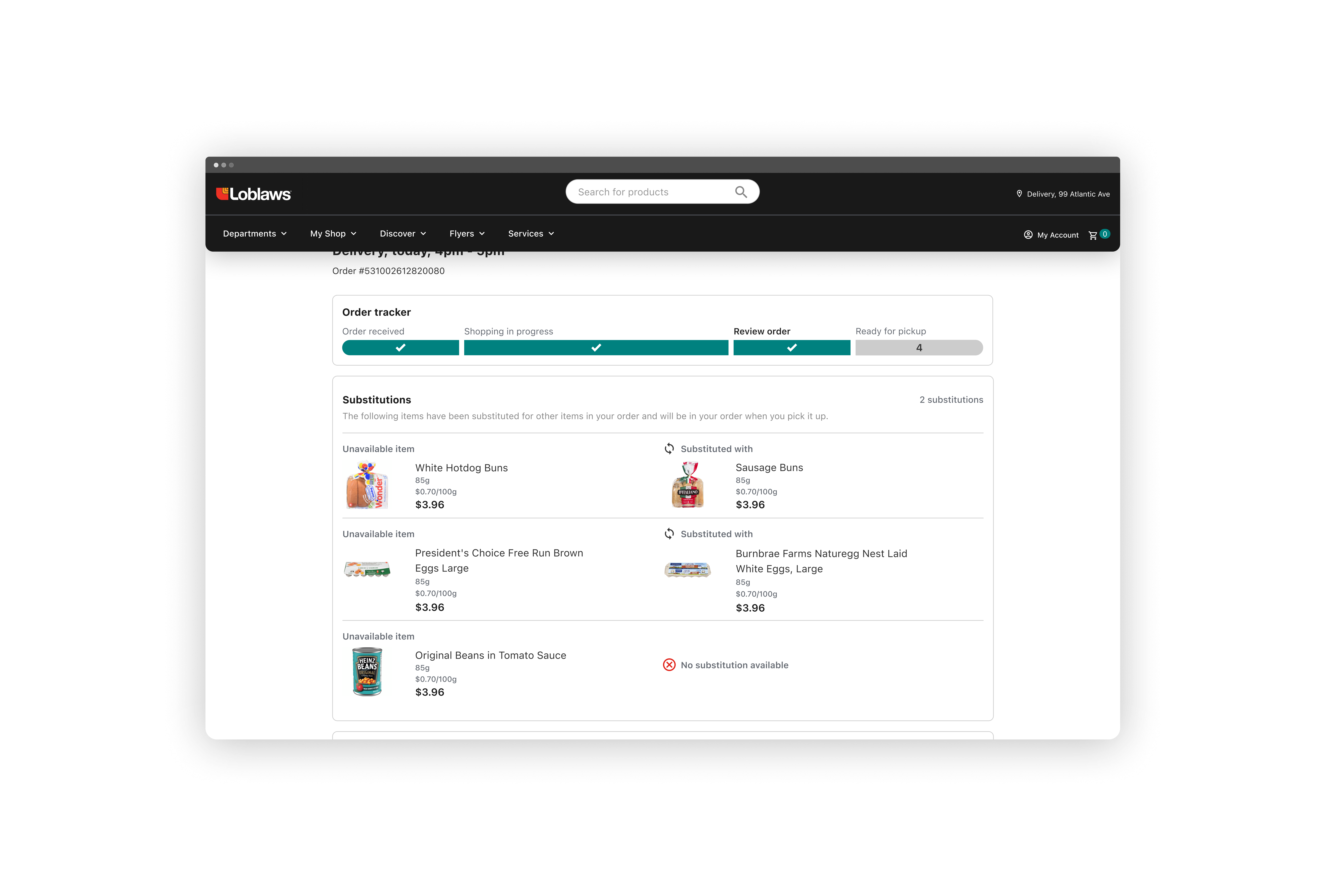

Though customers could use their app or the website to see the status of their order, their order updates were shown as read-only, and thus they relied on the call to make changes. The existing system was also limited to substitutions or out of stock items, whereas the scope of the call could also cover things like expiry dates.
Identifying the right problem
Before this project even kicked off, the Product team on the Ops side came to us with the solution already picked out (digital substitution management). Though it made sense logically, our team (on the customer facing side) didn’t know whether it was highest priority for us. We wanted to be involved from the problem identification phase, rather than be brought in to execute on strategy already thought out.
Workshopping on the problems with substitutions
I worked with the Ops team and decided to design out a series of workshops to make sure we knew what problems were of highest priority, what solutions we could ideate, and which solutions had the highest impact. I ran these over the course of a week and had everyone involved from the business, product, design, and especially engineering (who helped identify the effort required for the work).

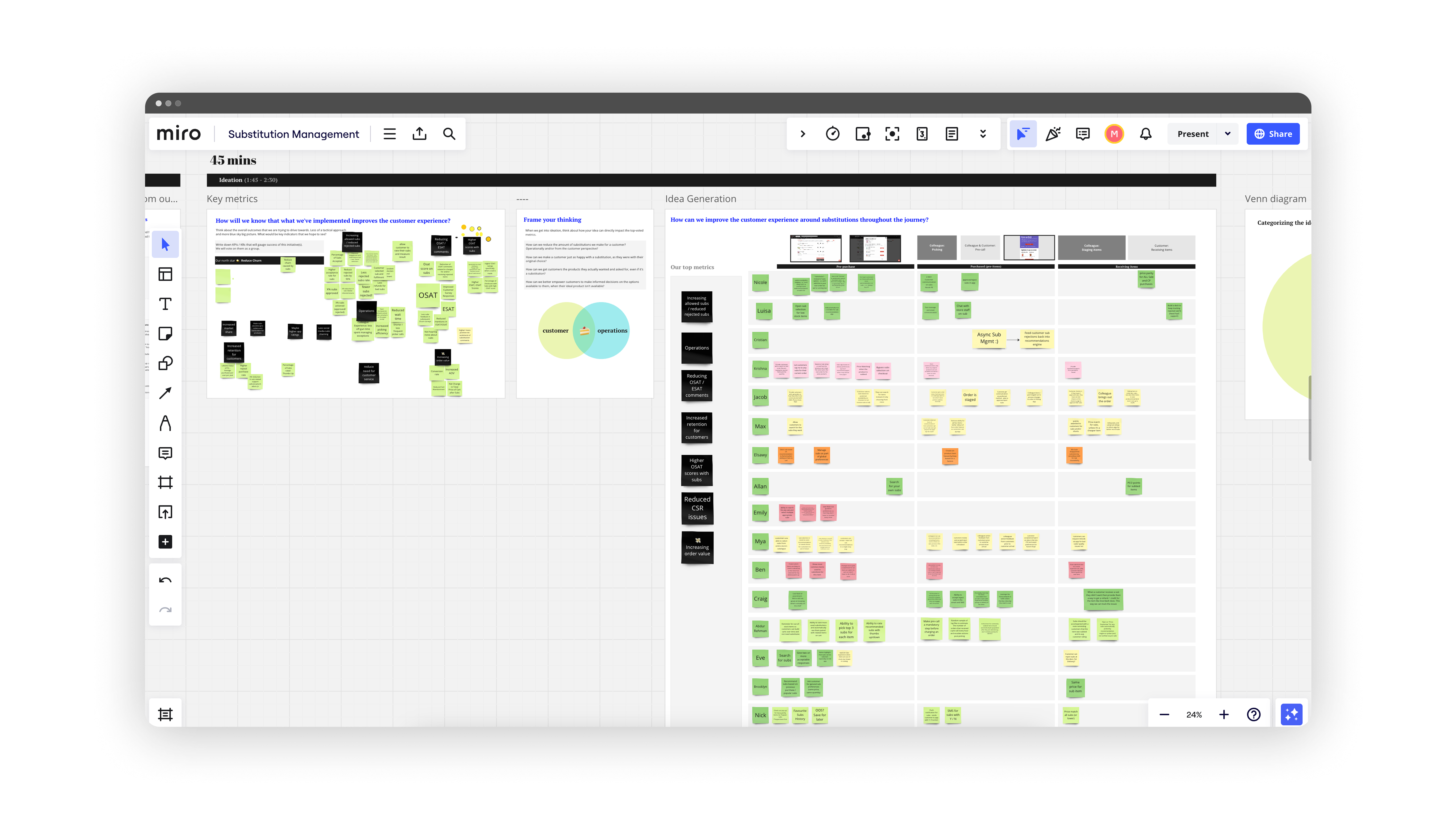
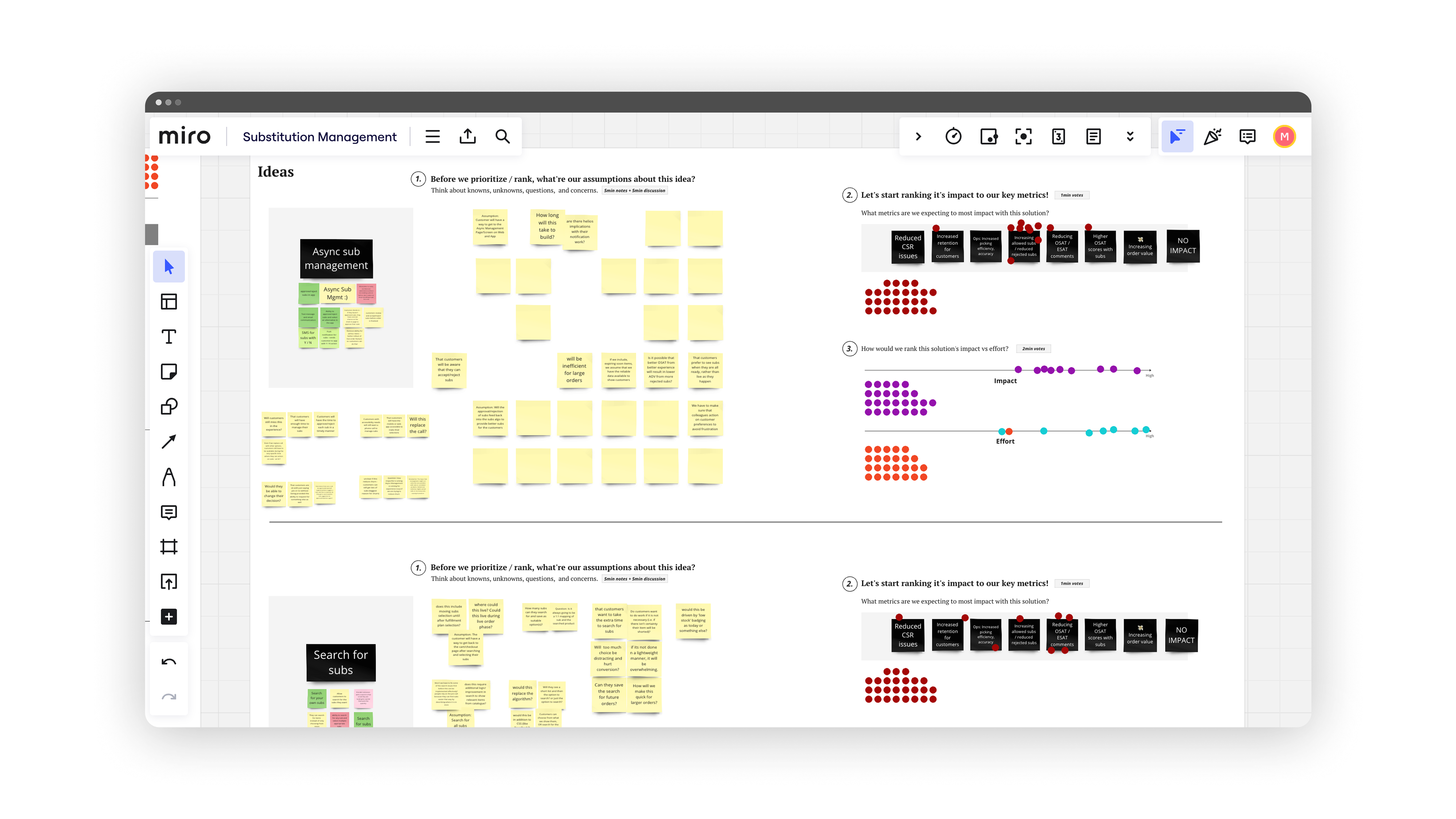
Aligning on "Async Subs"
In the end, the highest impact and lowest effort solution ended up being Async Subs (the digital substition management solution) regardless, however, it aligned everyone on why and also helped populate our backlogs with additional opportunities. The outcome of this was to present the findings to our leadership teams to get their alignment on how we got here too.
Mapping the impacts of substitutions
That larger alignment allowed us to focus in on the post-order process for customers — as that’s when substitutions happened.
Post-order blueprint
I worked closely with the Ops team to map out the blueprint at a macro scale to validate where the impacts would be, and also understand the ideal path. I learned that since customers could set their substitution preferences before placing their order (for example: choosing "No substitutions"), they should not receive any notifications about substitutions in their order.
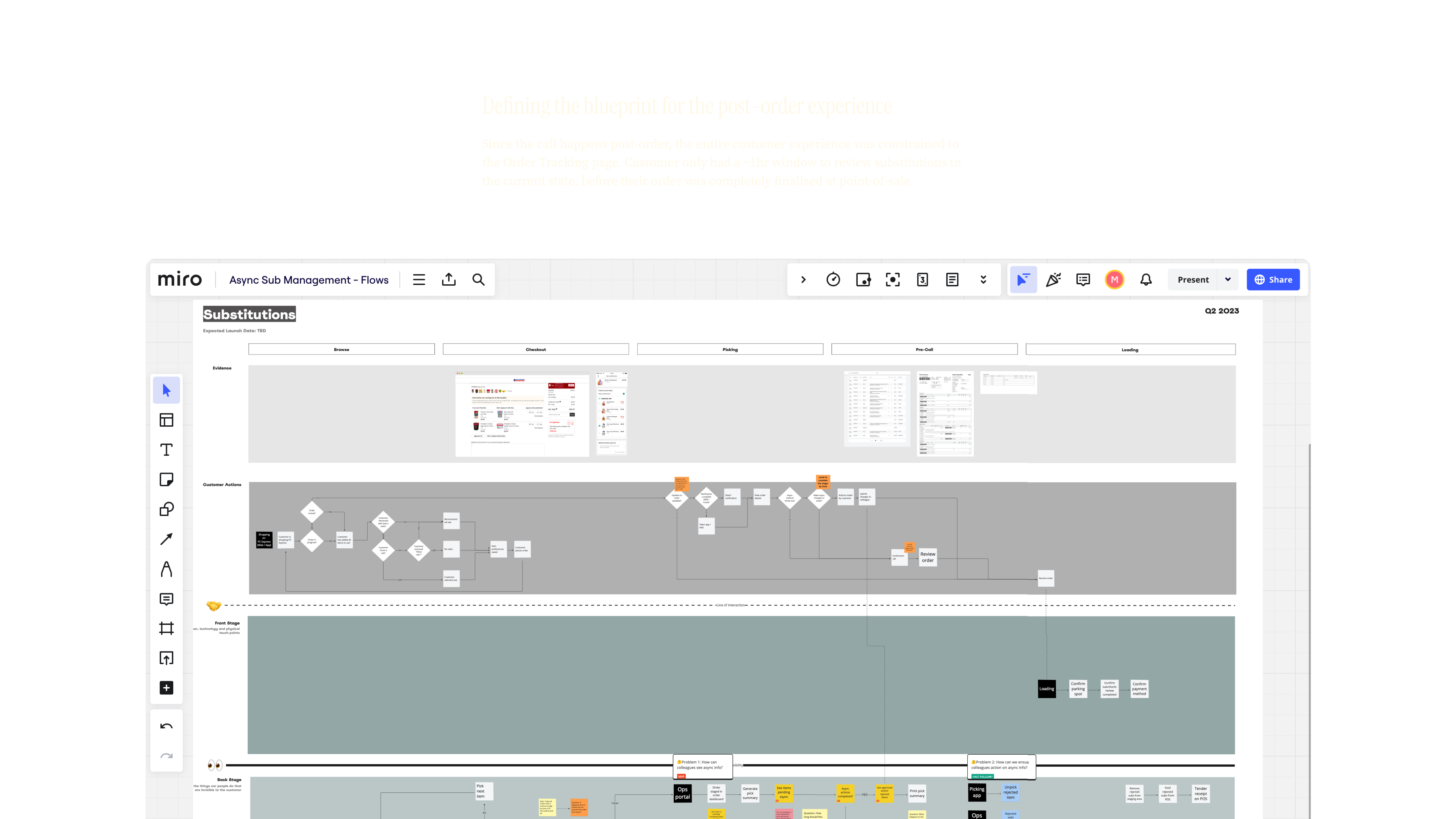
Approvals and rejections
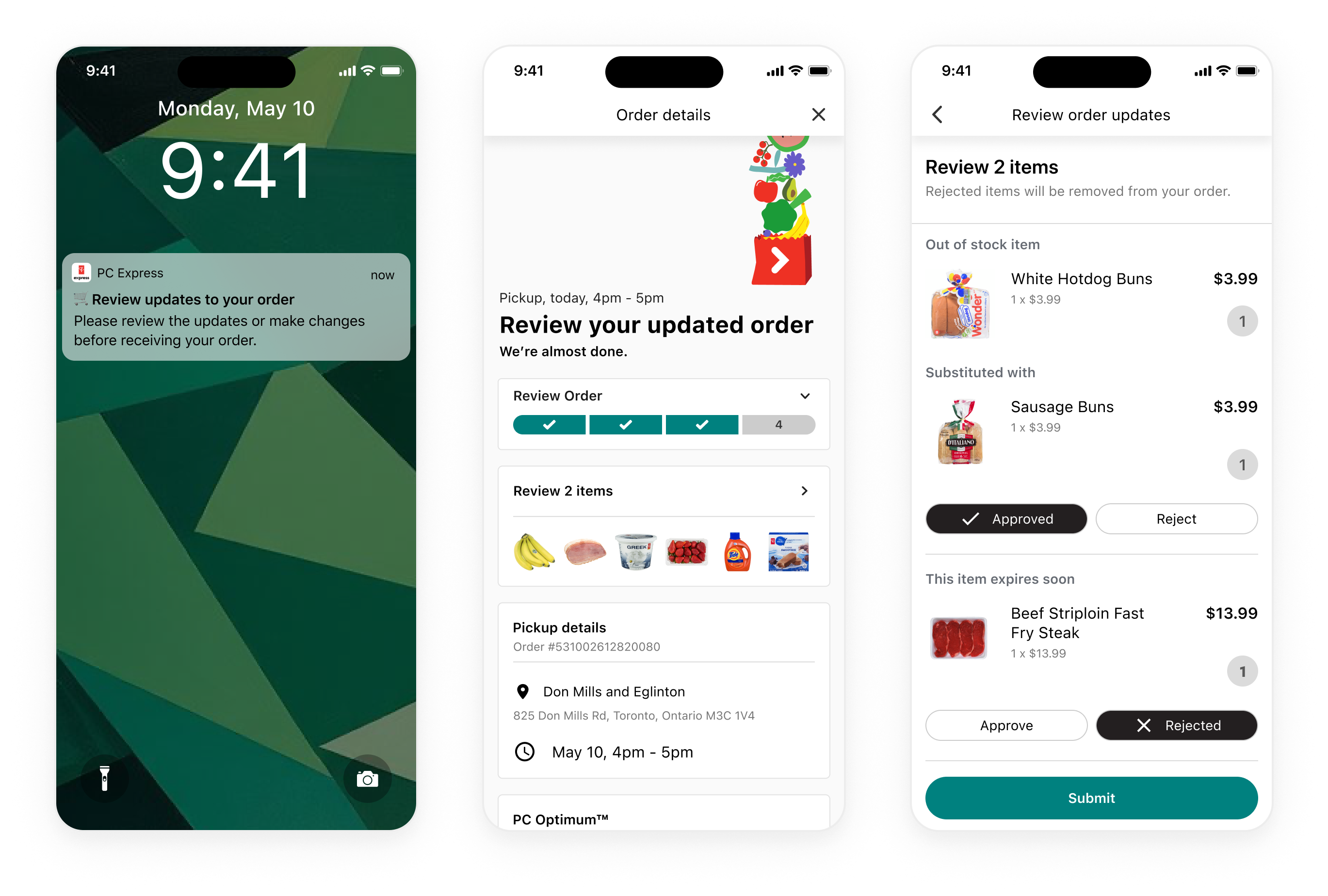
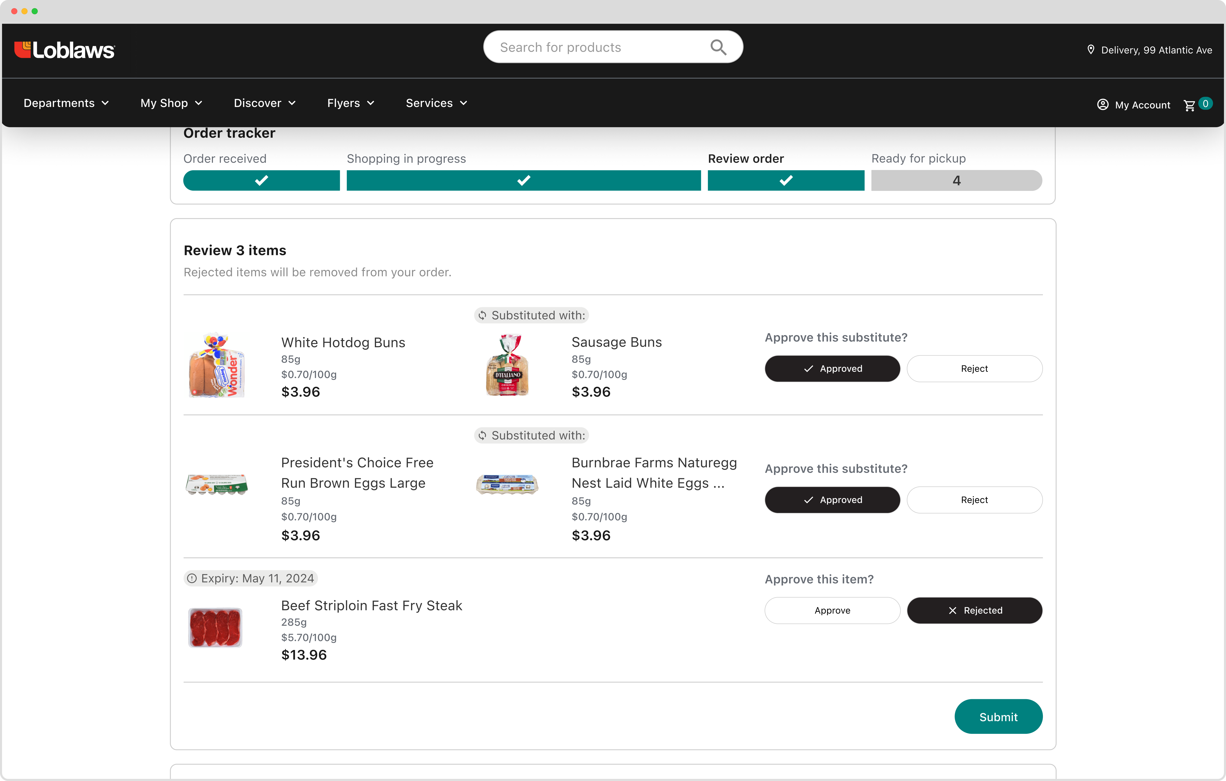
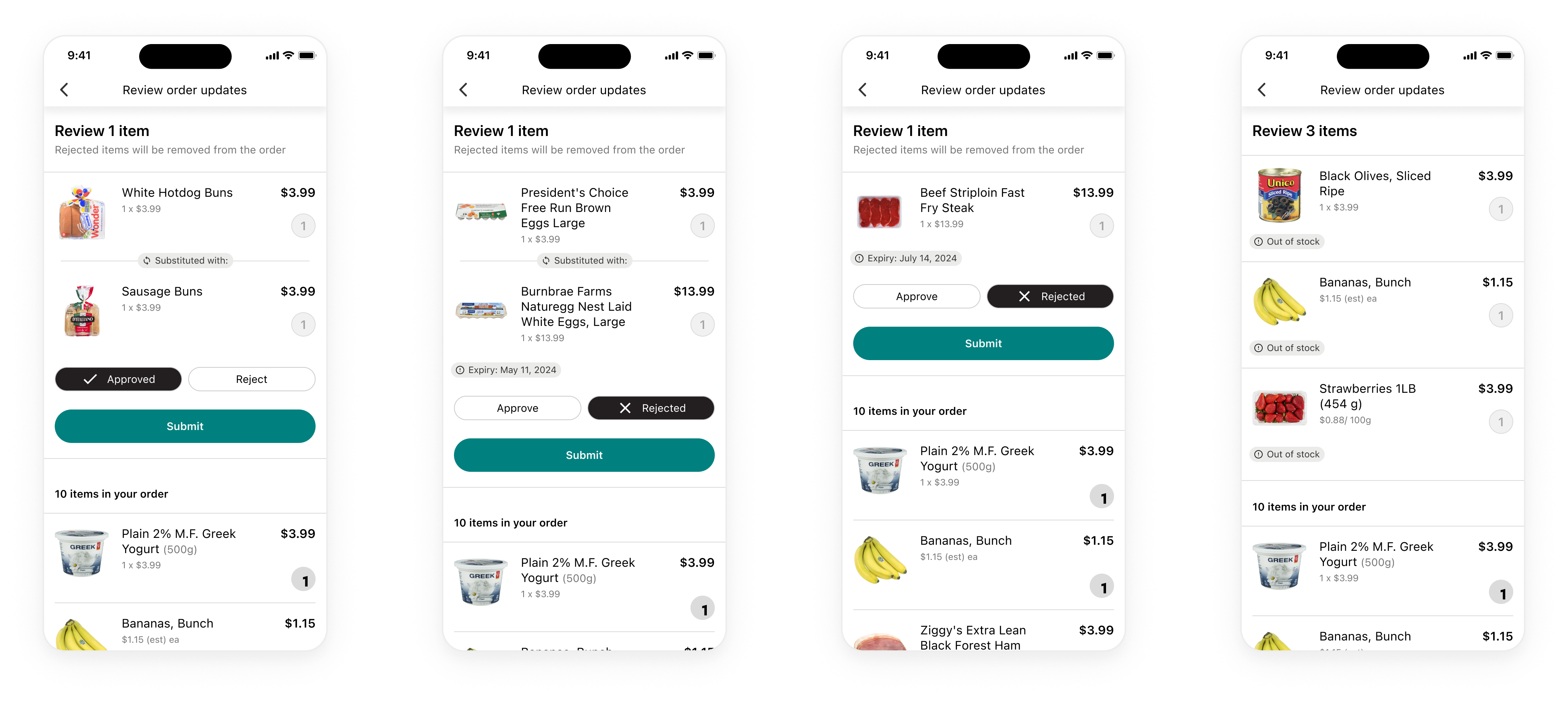
Specific to the user-interaction, we wanted to constrain users to only be able to select whether they approve or reject a item; this included substitutions and items that could be expiring soon. We strictly avoided having an open text-field to reduce variability in the post-order process.

At this point, I was in lock-step with my dev-team to make sure nothing we were proposing impacted our original effort estimates.
Aligning on initial designs
Based on the flows, the designs for the experience were simple enough. I designed and added Approve/Reject buttons to existing surfaces to not have to teach users anything new in a time-crunch. The bigger concern was around notifications if they would appear in time for users to act on their substitutions.
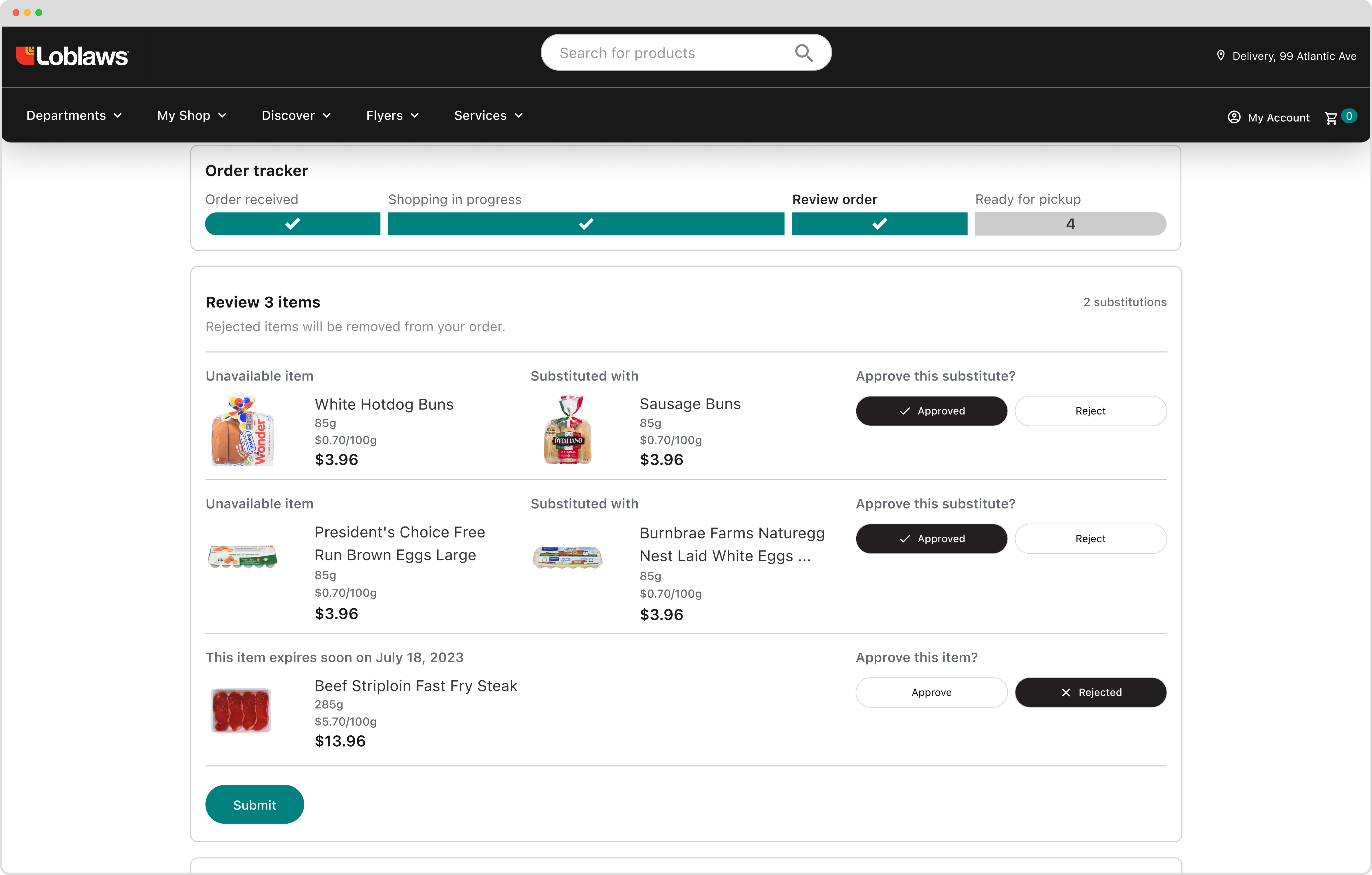
Exploring (and scrapping) alternate approval flows
I wasn't going to include this as part of this case study, but it helps tell the story that sometimes the simplest solution is the one you should go with. I had explored designs that, although solved for an edge case, they drastically impacted dev effort and the core experience for most users.
What if users didn't hit submit?
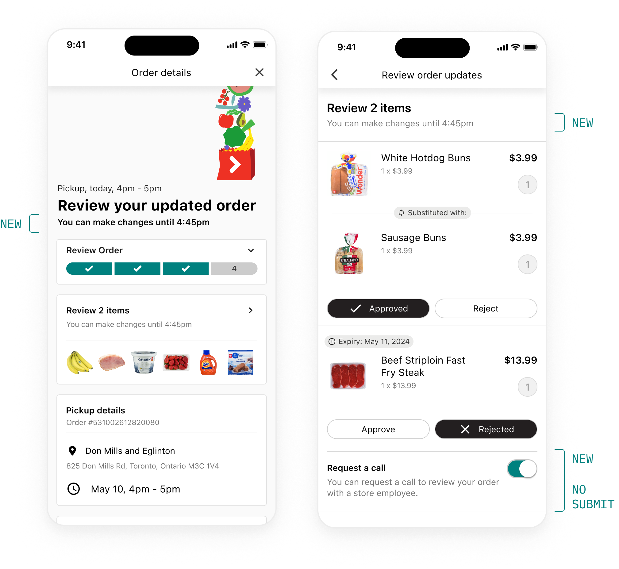
Despite the async approach we were designing for, the phone call was still the fall-back solution. If customers didn't see their app in-time, or missed the review window, they'd still receive one to review their order. So, since the call wasn't really going away, I questioned if it'd be worth to introduce a toggle for all users to measure if we've been effective in solving our efficiency problem.
An additional scenario then came up where a user could miss the submit button and thus miss the submission for their substitution preferences. As a result, I designed an approach for auto-submission of selections once the order was close to pickup.
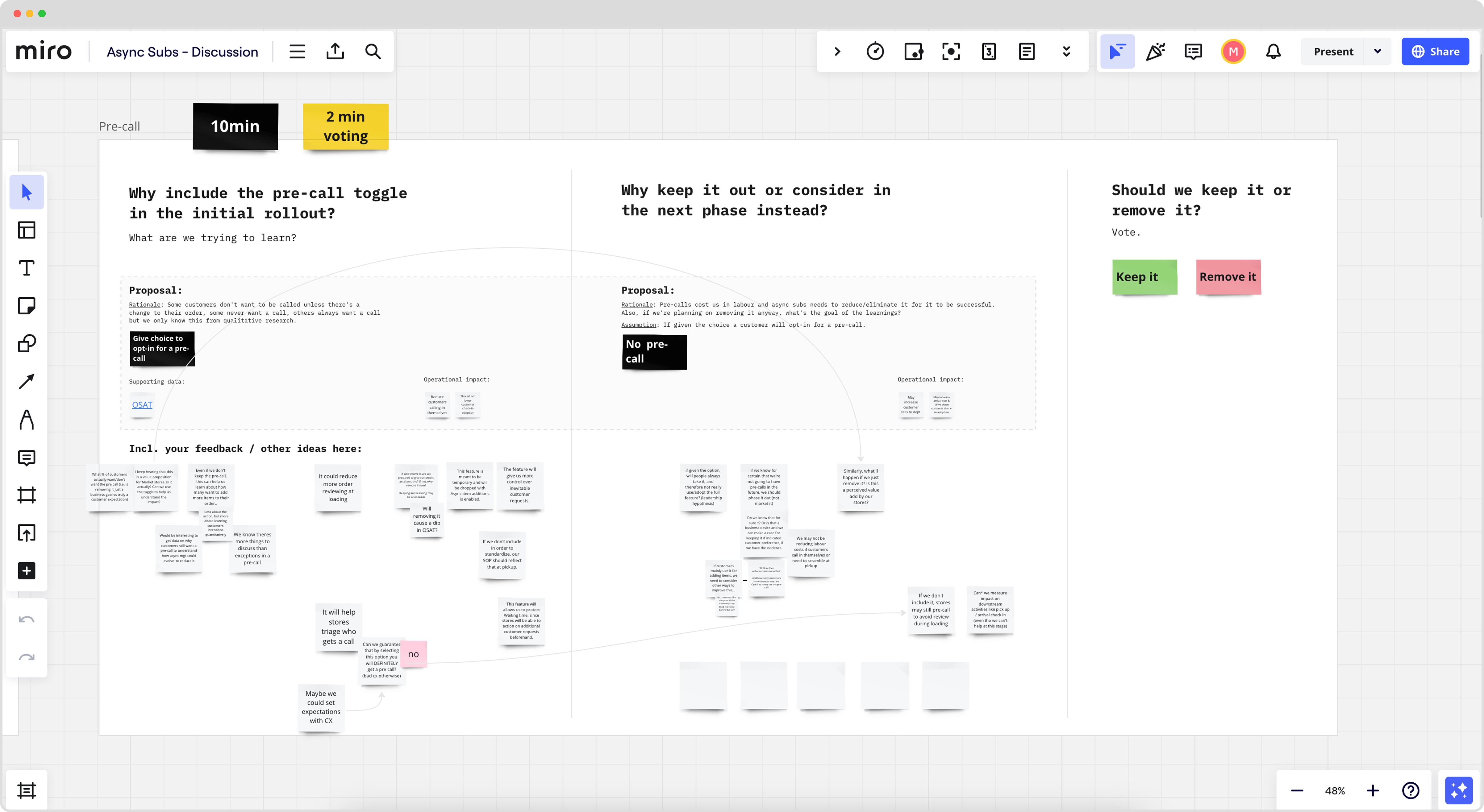
Workshopping for alignment
Though the auto-submit solved some customer edge cases, Ops was skeptical because of the operational impacts of batch submissions on efficiency. Similarily, we started to question the phone-call toggle and if it's even needed to measure the solution's effectiveness if the long-term goal was to get rid of it anyway. We ran, yet another, workshop to get alignment and decided the toggle wasn't worth it.
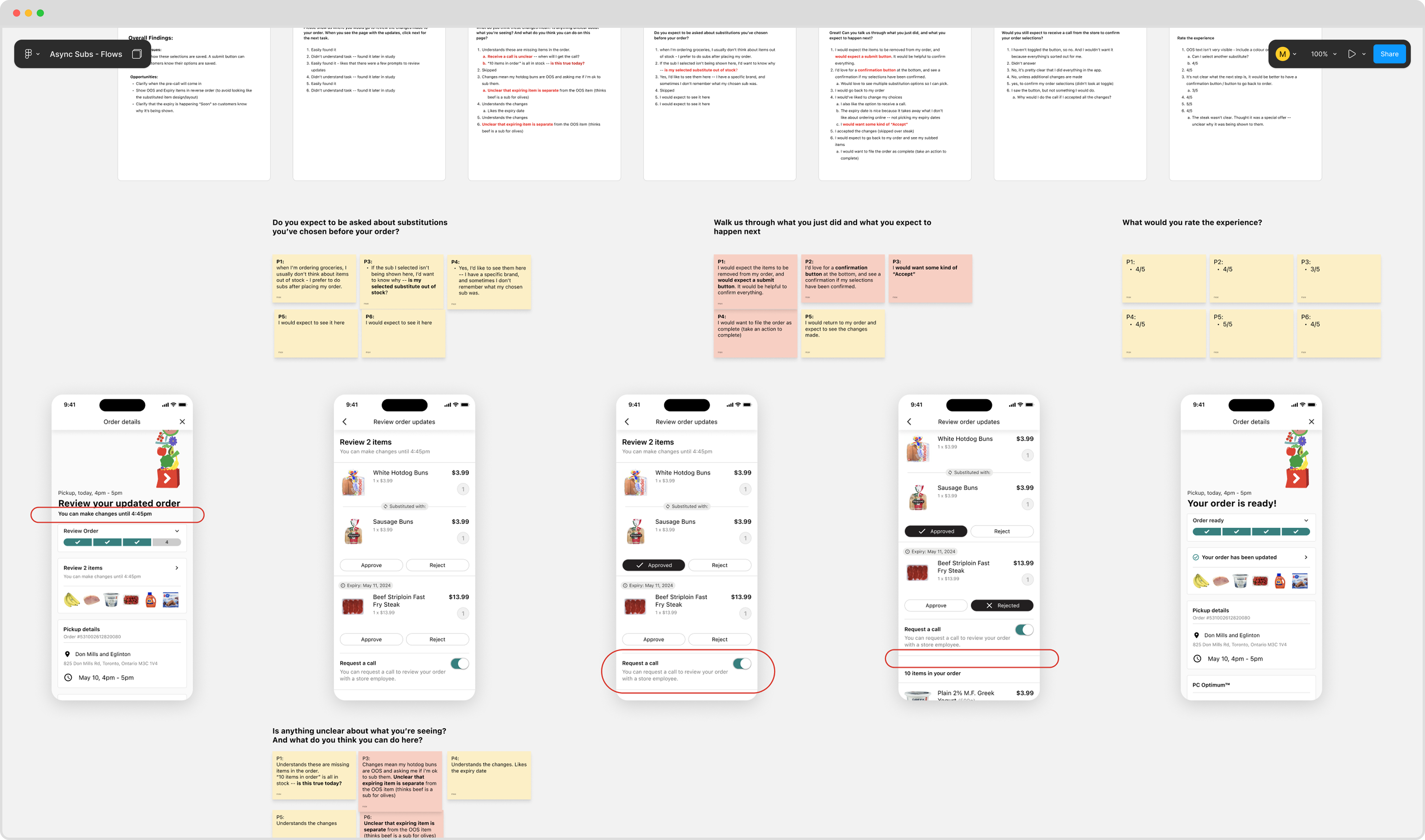
Usability-testing also affirmed the Ops team's decision for the reversal on the auto-submit as users commented that they wanted a submission to lock in their selections.
* * *
Outcomes
We launched, and within 6 months had incredible results. Though we had hypotheses around customer experiences faltering due to the lack of the call, customer adoption reached over 60%. In the same period, the program contributed to 60,000 hours saved for store employees and over $3M in projected annual cost savings as a result of operational efficiency.
Learnings
Balancing business needs with customer wants was a constant theme throughout this project. The Operations team was initially hesitant about the workshops, as they felt confident in their proposed solution, but ultimately found value in the process as the outcomes helped inform the roadmap.
Despite the contextual complexity of the problem, the solution itself remained intentionally simple. I enjoyed owning this project end to end—from discovery and solution definition through detailed design and launch. It was a rewarding challenge and an opportunity to design something that made a meaningful impact for both store employees and customers.