Subscribe and Earn
What goes into designing the first recurring item subscription program for Canada's largest grocery chain?
Case study · July 2024



Overview
PC Express is the e-commerce brand for Loblaws, Canada's largest grocery chain. Over 3 million Canadians depend on it for their grocery pick up or deliveries, generating the business close to $2B in revenue annually. A major value-add to using PC Express is the associated PC Optimum loyalty program, which rewards customers with points on every purchase they make.
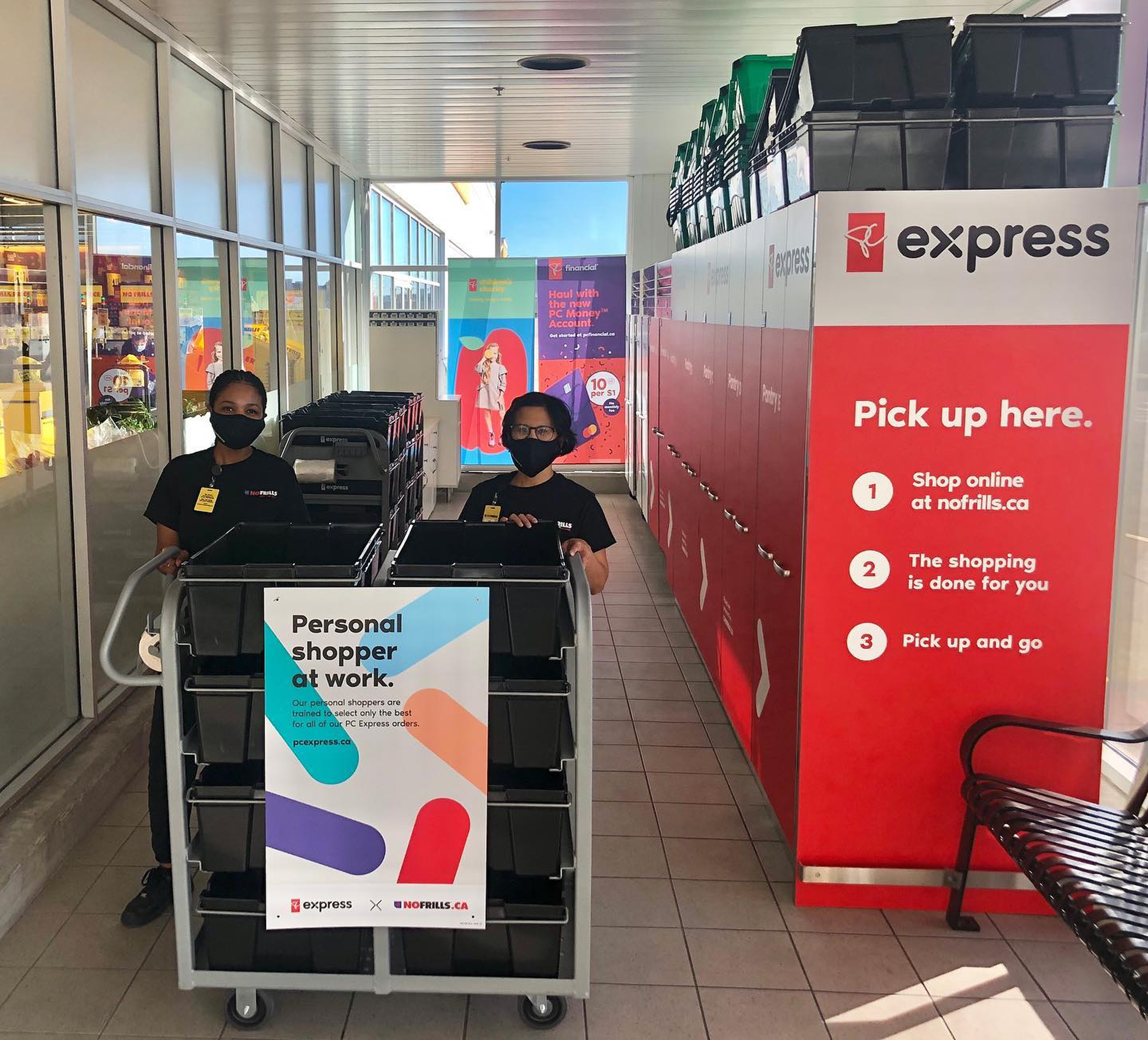
I worked as a Product Designer on the PC Express team focused on growth initiatives that would either bring new customers to using the service or encourage existing customers to shop with the business more. The biggest business initiative that PC Express underwent—at that time, in 2024—was for Subscribe and Earn; I led the design for that initiative.
Throughout the program, we faced many technical and business constraints which directly impacted the strategy of the program. Immediately after launch, the program did not see the numbers we initially expected due to constraints in the experience; however, the program picked up after a major marketing push and became extremely successful.
* * *
Research was scarce
The business need for this program was decided with minimal research (yes, really). Our fantastic UXR team had some 3rd party findings, but they came after this initiative went into the roadmap. The core findings were that customers did in-fact value subscriptions, and we saw so with competitors increasingly launching their own experiences.
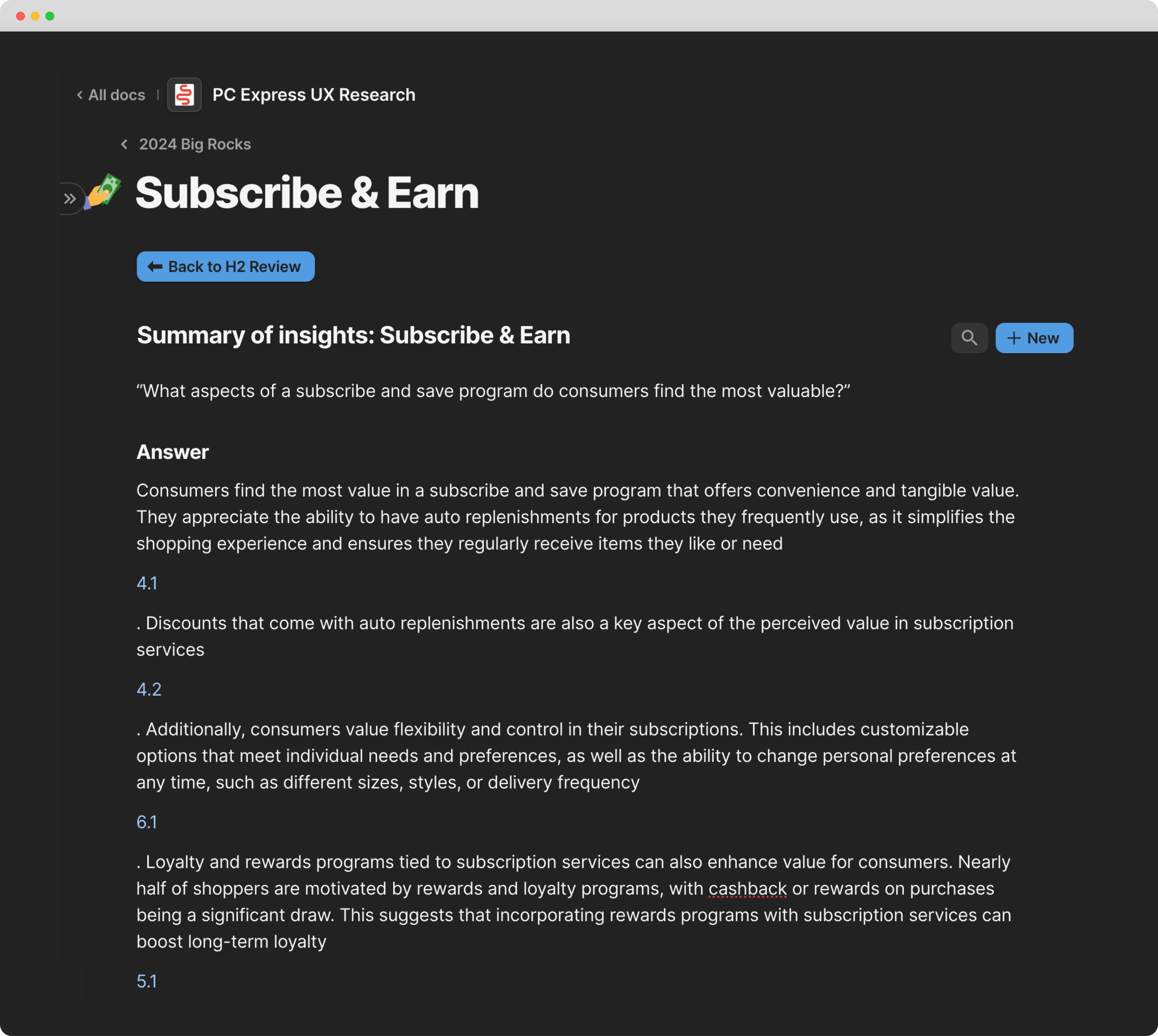
To fill in the gaps, I worked closely with my analytics counterparts and learned PC Express customers consistently repurchased repeat items, giving us a signal perhaps they'd want to get rewards for doing it on a set schedule. One interesting finding was that most customers placed a single large order per week, which began to spread doubt about the potential success of a subscription program.
Mapping subscription programs
Since we saw many competitors going down this path, I started to map what their experiences looked like and what themes I noticed.
Competitors
I looked specifically at big brands that sold similar products to PC Express such as Walmart, Safeway, and Amazon. Mid-way through me mapping out these flows, Safeway had completely changed their subscription experience, and Instacart shut theirs down (which sent a panic to our business team, but we persevered).
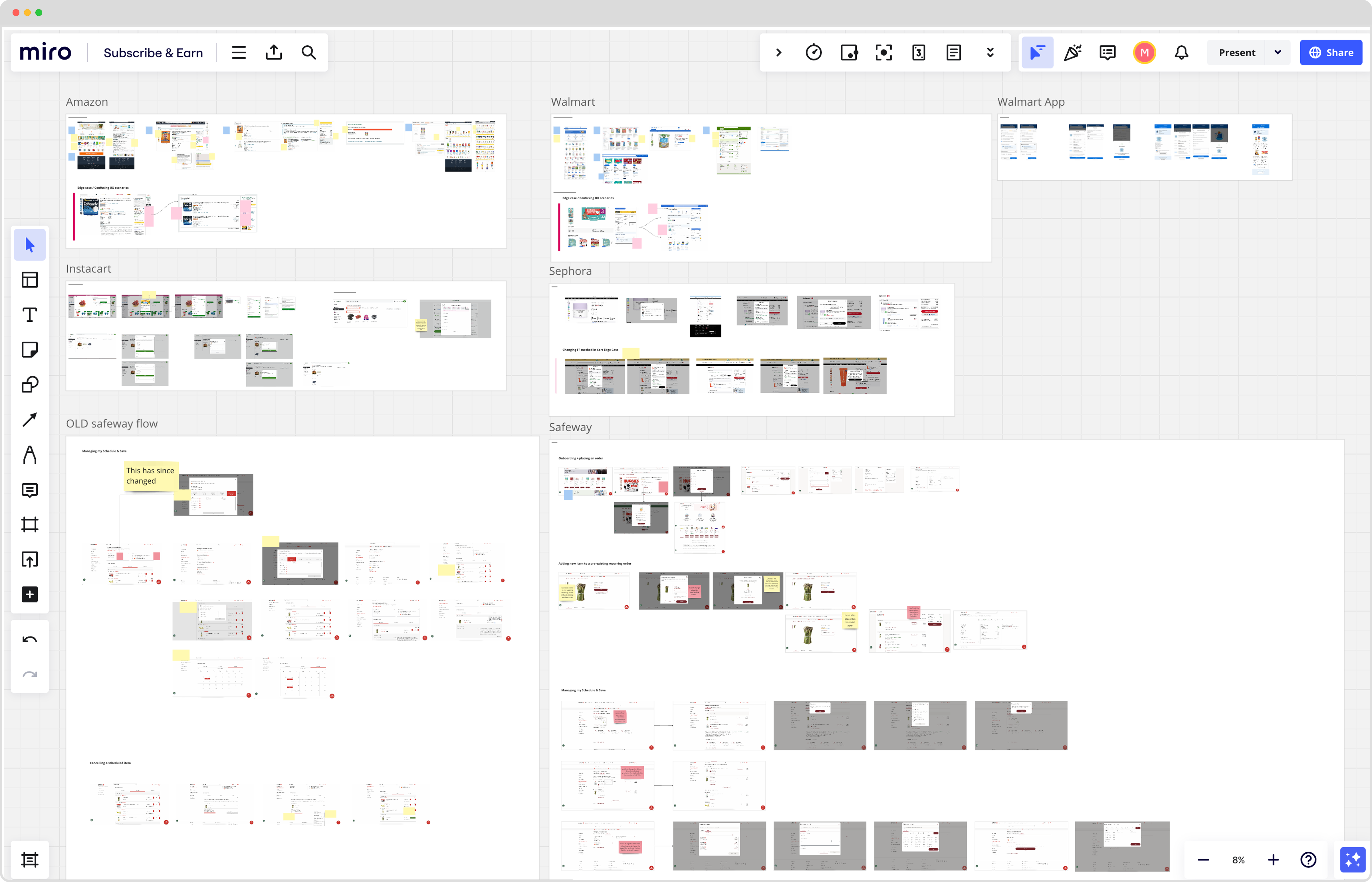
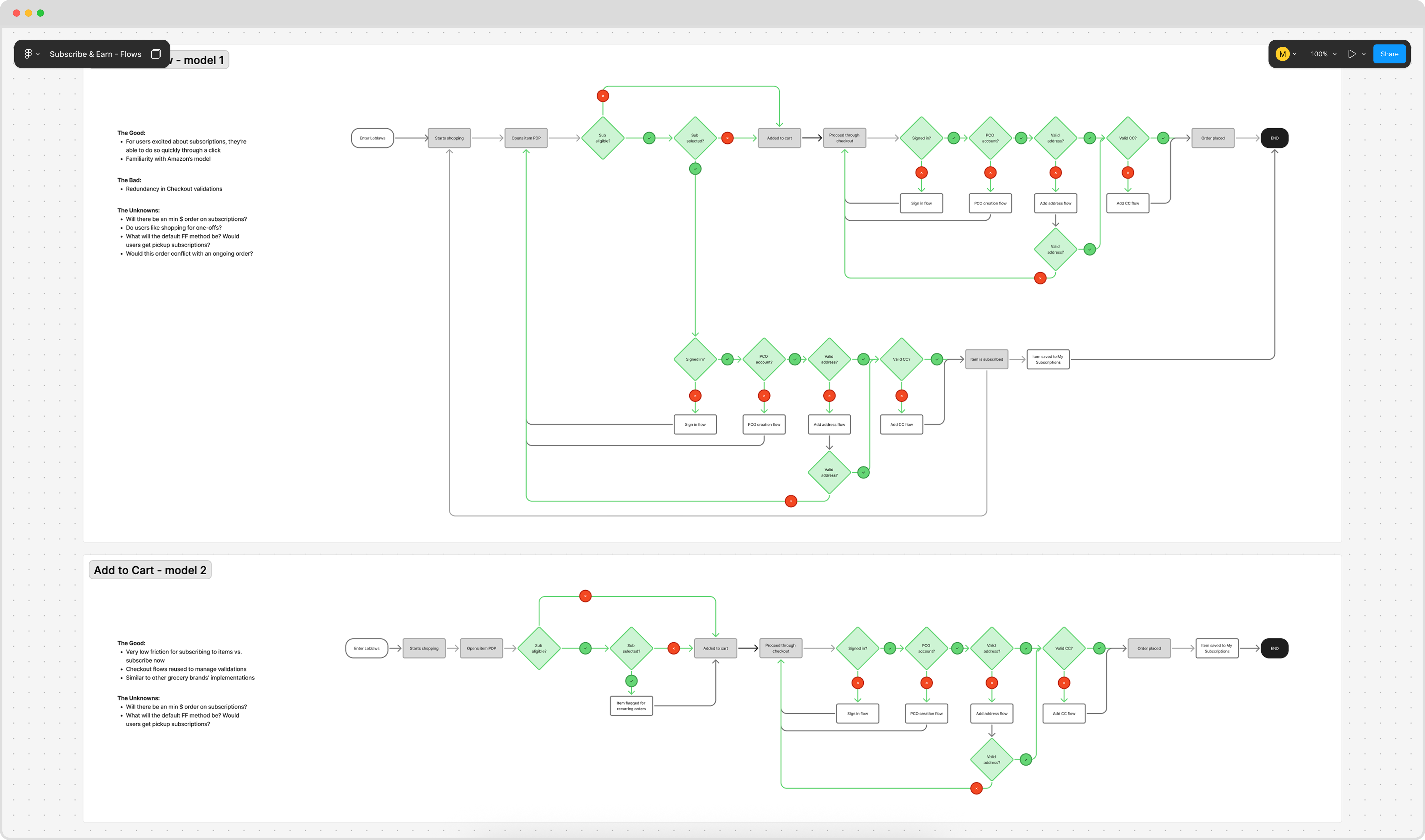
Across our competitors, I noticed two common subscription designs: "subscribe now", which let customers subscribe immediately from a PDP, and an "add subscription to cart" which kickstarted a subscription post-purchase.
Core subscription flows
Surface-level, the subscribe now flow seemed simpler, but it was far more complicated technically because it required the system to trigger a checkout flow from every PDP. It also didn't follow how our customers typically shopped (one large grocery order per week). My PM and I both agreed to proceed with the add-subscription-to-cart flow and I began kicking off explorations.
Core UI
I designed for both web and app, but for brevity I'll only show app. A lot of the design phase was mixed with looking at competitors to see if their experiences mapped to PC Express, and also exploring net-new designs.
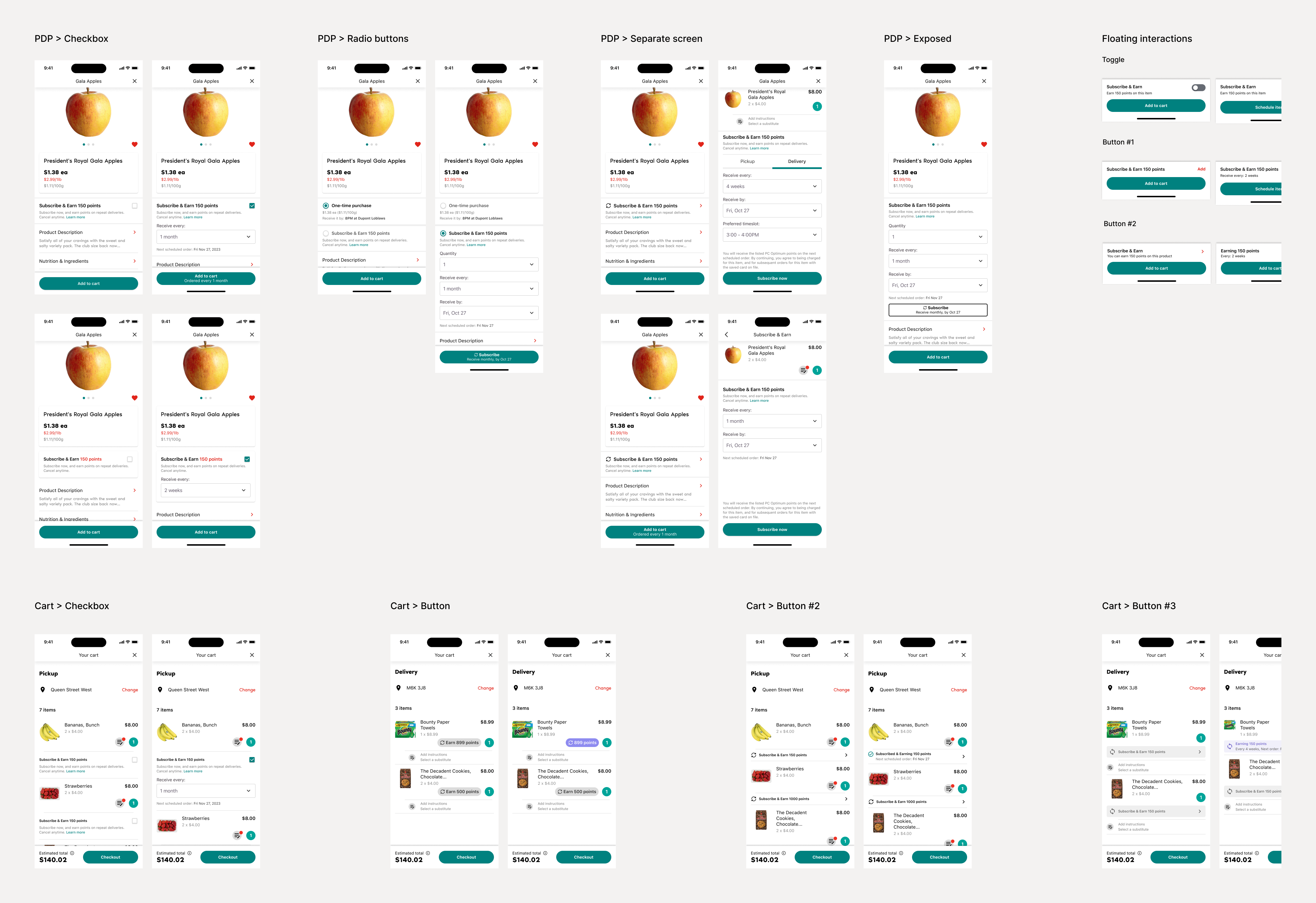
I went through multiple iterations for how we could tackle just the "subscribing" experience from the product page, as well as potential options with having a toggle above the add-to-cart button. I ended up deciding that the friction in having multiple screens was worth it to make users aware that they were subscribing to an item, and allow them to define their quantity and frequency for the items.
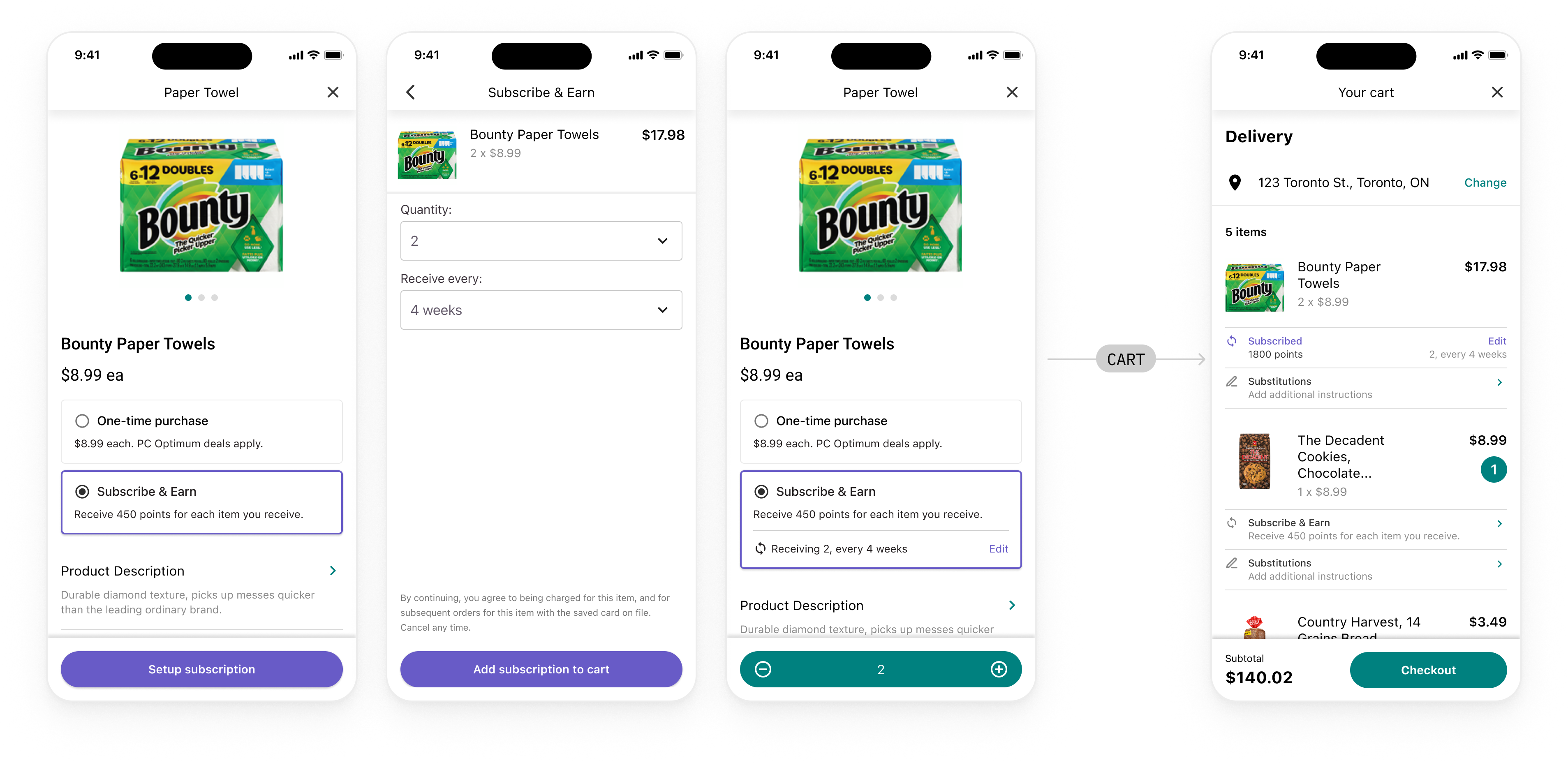
Designing with business constraints
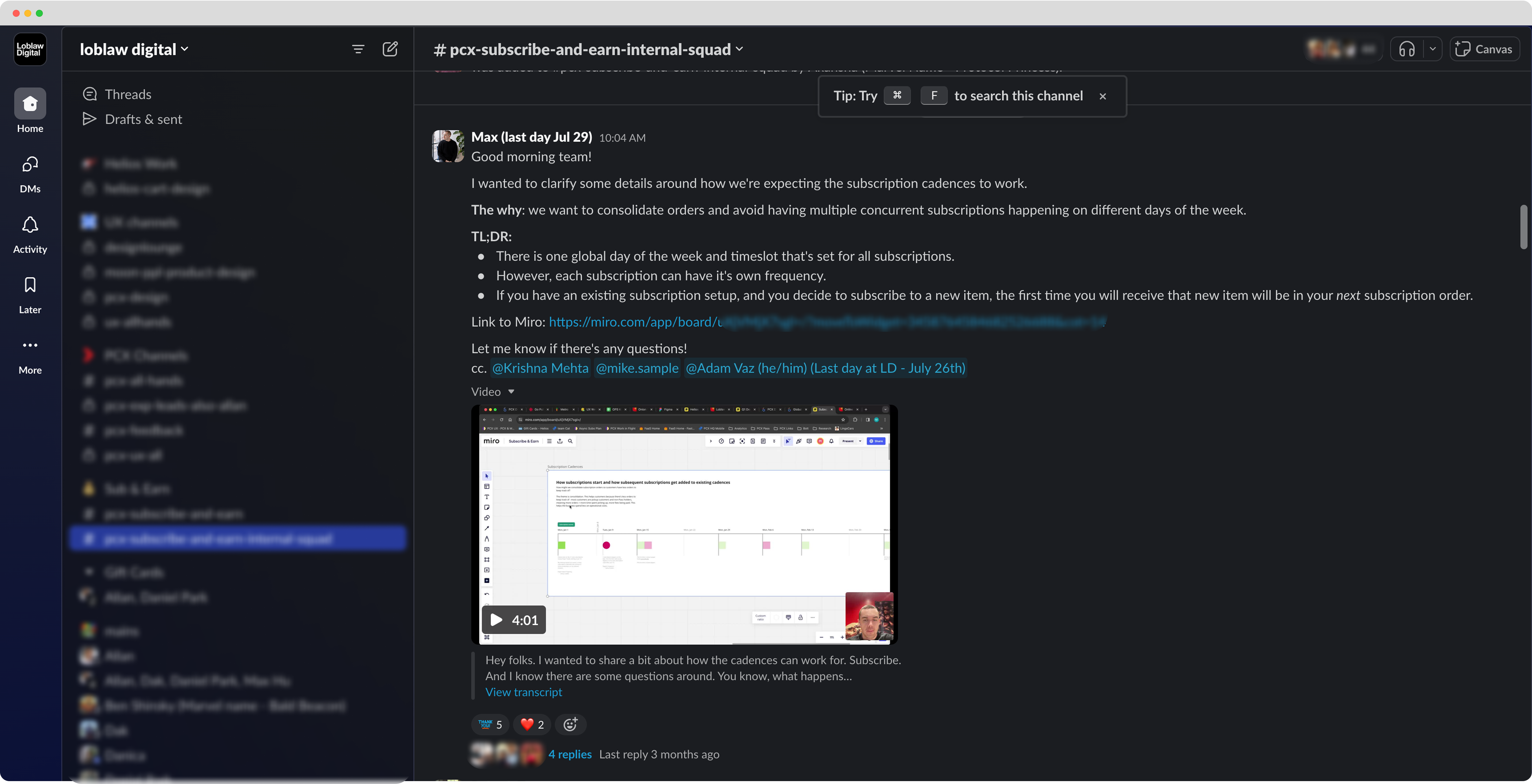
Once we had a great happy path, and things were looking good for the program, the real huge blockers come up. Basically, our platform didn't allow users to have multiple concurrent orders at time. This created a mess if you wanted to place a regular order for some bananas, but your subscription was coming in a couple days.
One order at a time
This constraint was by design. We only allowed customers to have one order open at a time and set a $35 order minimum to ensure we were profitable. What'd happen is, if you placed an order today for delivery next week, that order will stay open until it arrives. This means any other items you add to your cart until then will be added to that same order(!).
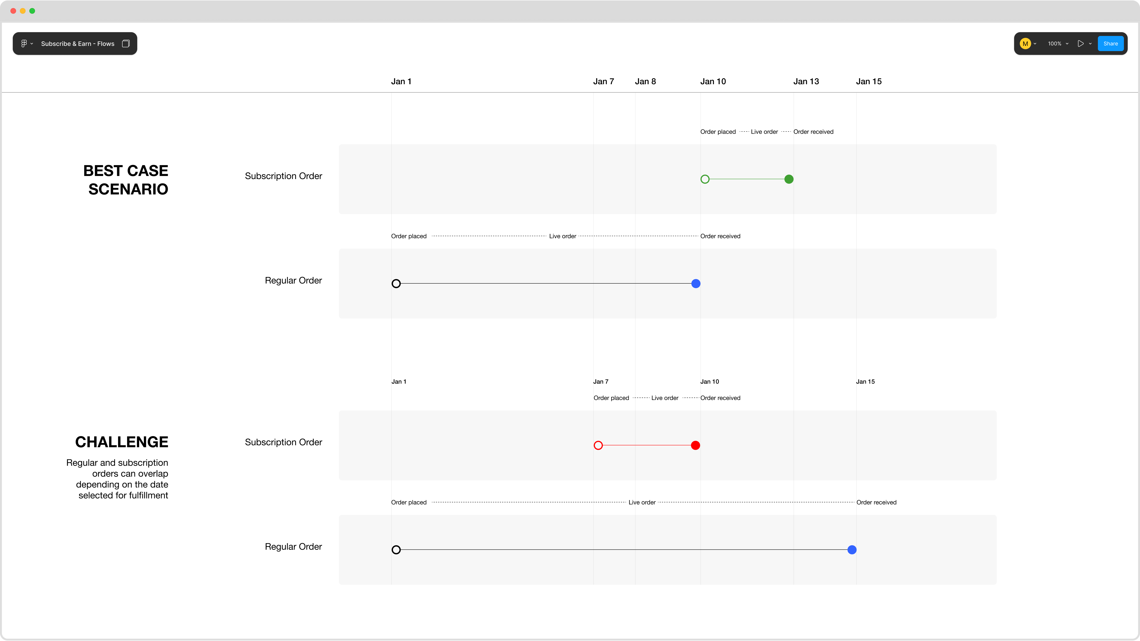
To avoid multiple overlapping orders, what if we merged the orders into one?
To account for $35 order minimums, what if subscriptions always arrived on the same day of the week?
Merging and consolidating
For the merge experience, if a user was building a cart or getting ready to place an order, I designed a process to ask them if they wanted their subscription added to their regular cart. If not, it was skipped; y i k e s (more on this in a bit...)
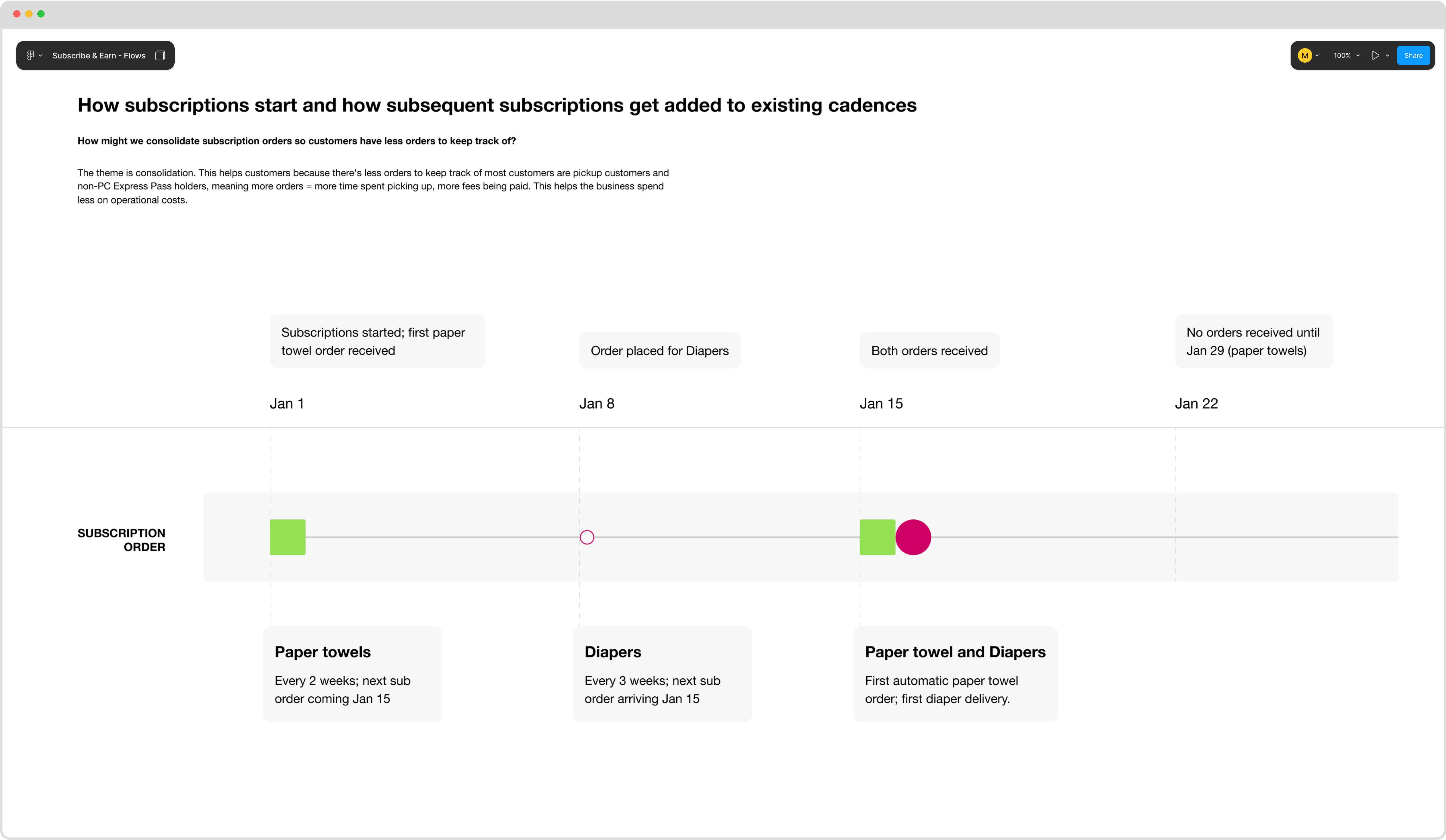
And for the order minimum, I designed this concept that I like to call consolidation. Once a customer sets up their first subscription, all future subscriptions would arrive on that same day of the week, regardless of the date they were setup.
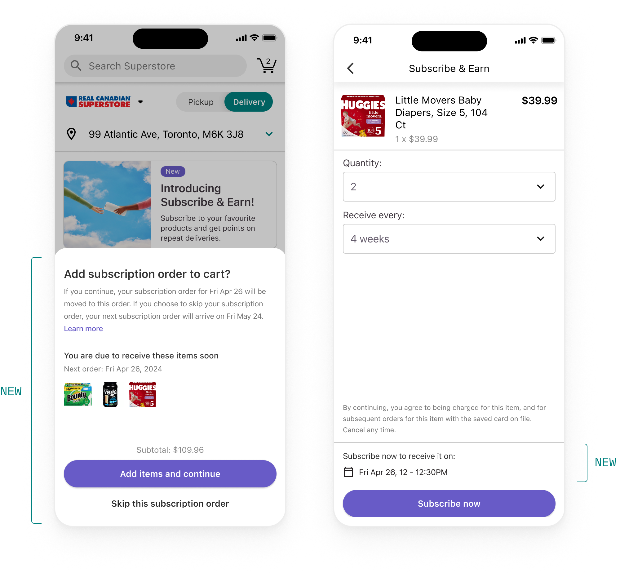
Customers hated the approach
Are those my only options [merge or skip]? I think I'd just unsubscribe entirely instead
We expected this to happen a little, since we wouldn't like this to happen to us either (as customers ourselves). So I knew I had to work with my PM to figure out a way to change it, but to maintain the essence of the merge to meet business goals. On the positive side, the overall concept of merge carts were liked by customers (since they wanted less orders per week), which was a signal that we were going in the right direction.
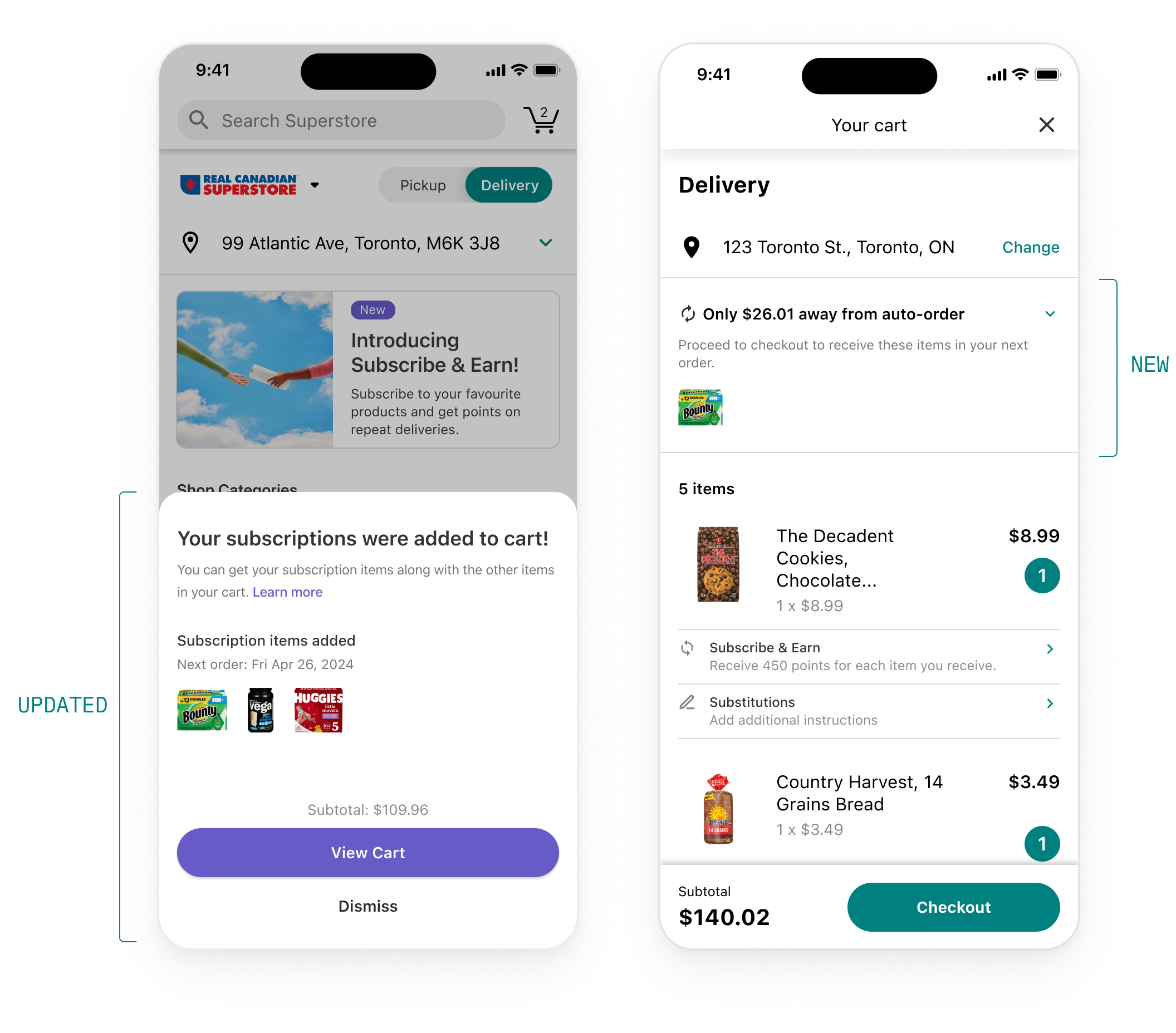
What we ended up doing is removing the decision point entirely and instead adding the items to cart automatically if there were items already present, or if the subscription order was less than the $35 order minimum.
Preparing for launch
Marketing and awareness
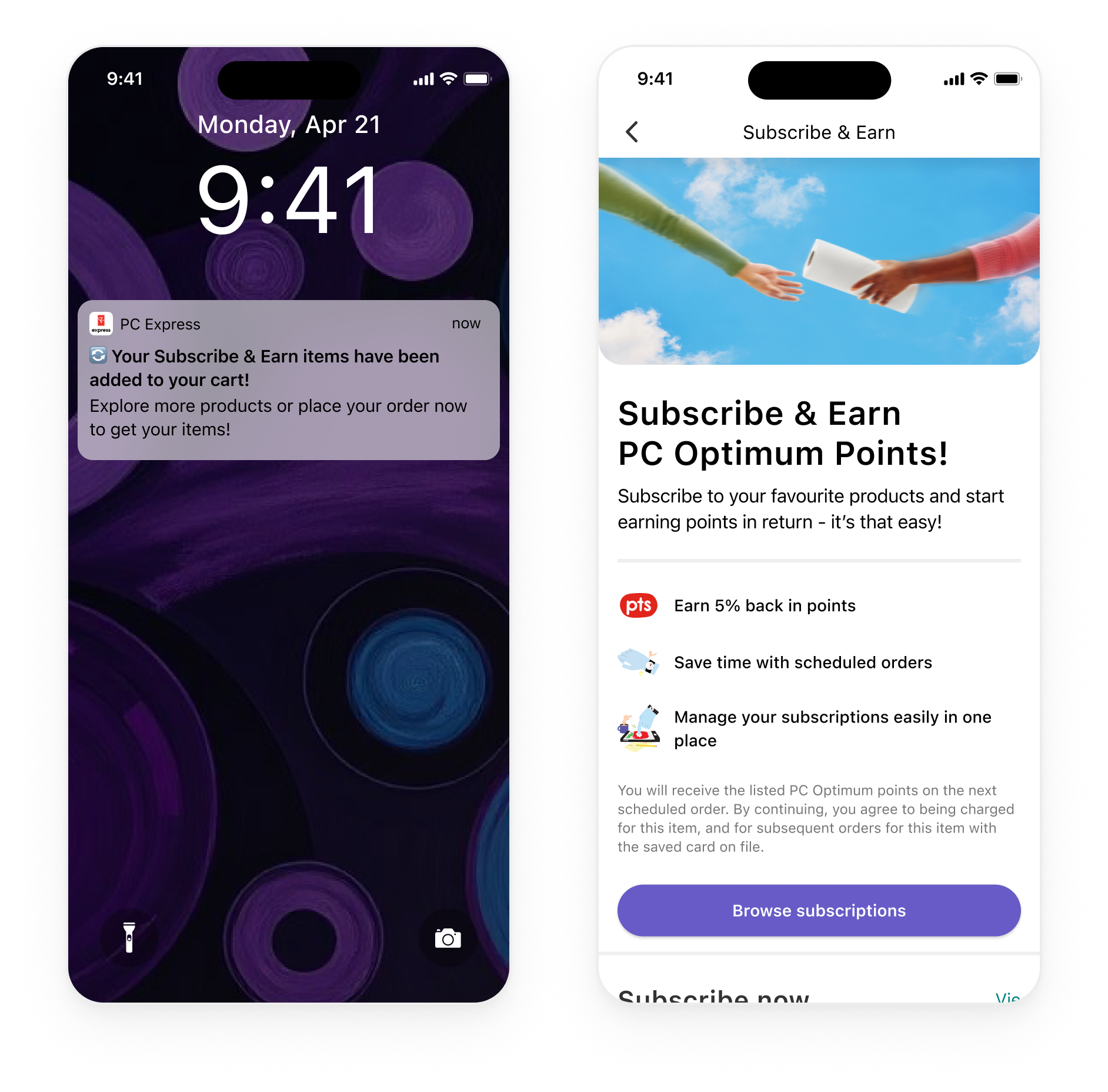
Closer to launch; I worked closer with our marketing team on designing out push notifications and a landing page to help users learn more about the program.
Robust management
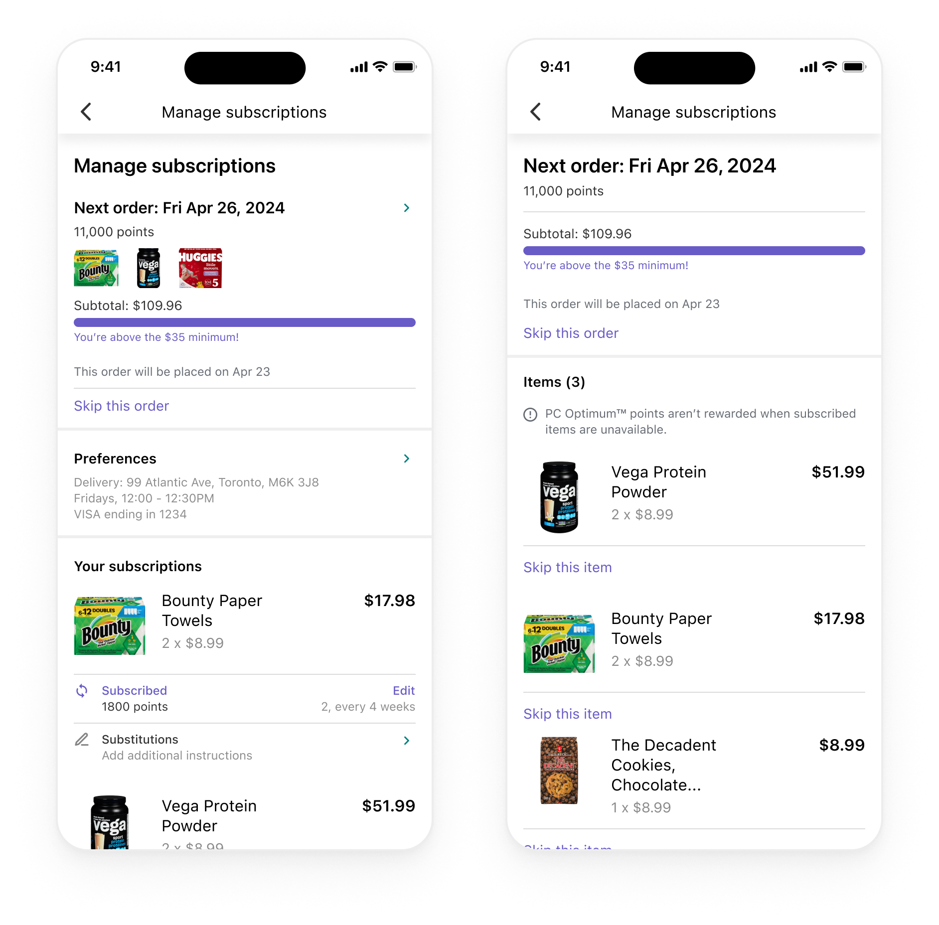
And throughout this process, I worked with engineering to design for a flexible management experience for users, so they could manage full subscription orders and the individual items. Unfortunately, the $35 order minimum counter was cut from the experience, but it would've been cool to let users know ahead of time if they were on track to get their items automatically.
Post-MVP considerations
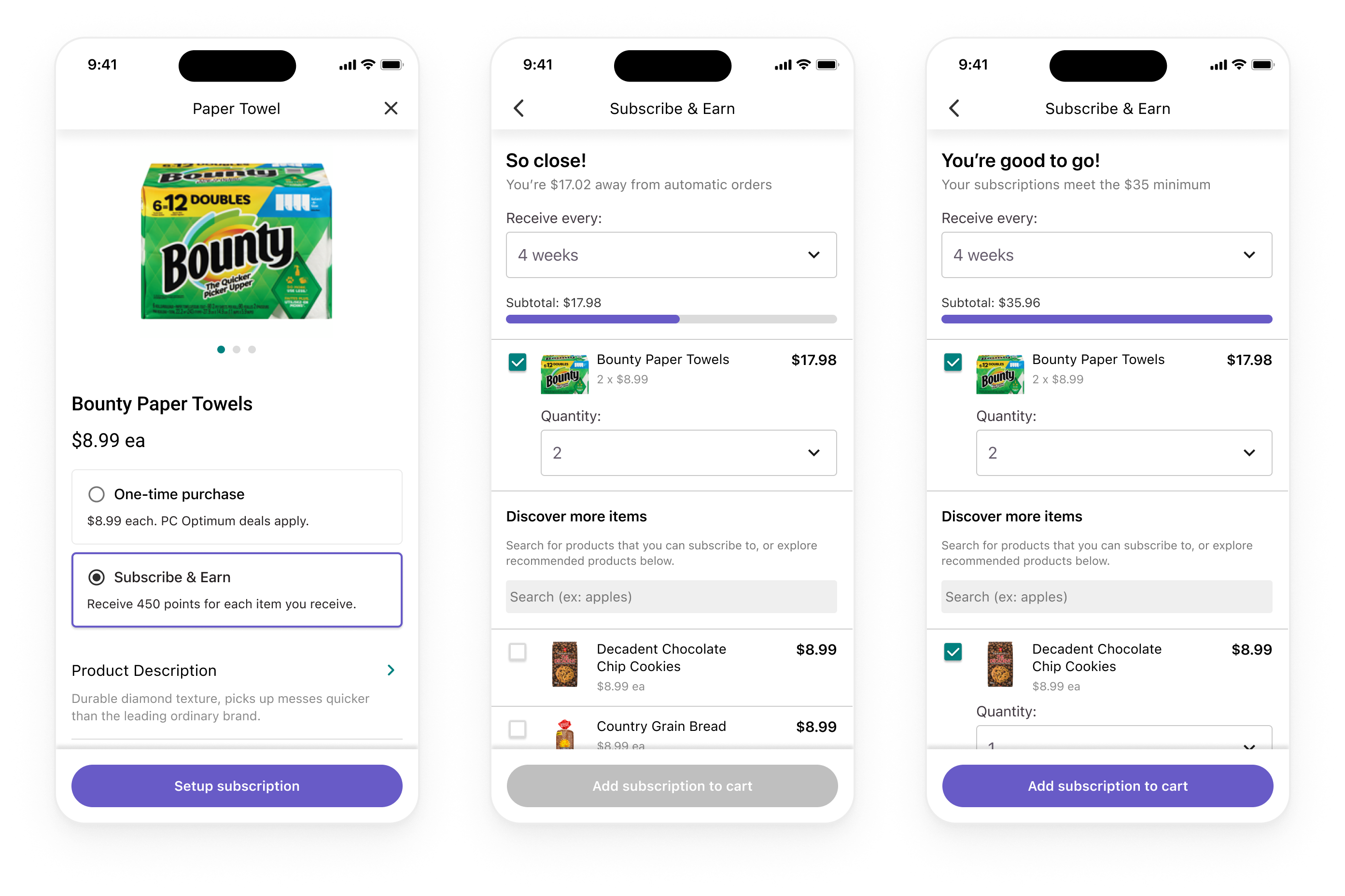
And one thing that was flagged as "post-MVP", that I wish made it into product, was this $35 order minimum flow. Essentially, we wouldn't allow users to subscribe unless their recurring order met a $35 minimum, and thus would remove a lot of the headaches we had with our other flows.
Outcomes
Within a few months, the program was very slow to launch... We had 600 subscribers, when we expected 70,000 for the year (which, also, was ambitious). Soon after my departure, however, the program took off and is still available today!
Reflections and learnings
As a reflection, with the challenges and core KPIs we had as a business, it's surprising this program made it on the roadmap. We should've instead started smaller and better evaluated the biz impacts of recurring subscriptions.
But as a learning - it was wild designing this from scratch. I learned a ton about the business, a ton about my team, and made a difference to many Canadian shoppers. We worked scrappy, fast, tried new ways of working through async walkthroughs instead of meetings... and so on. It was an awesome team.